﻿<!DOCTYPE html>

<html lang="en" class="wide wow-animation smoothscroll">

<head>

    <!-- Site Title -->

    <title>ABEX Exhibits</title>

    <meta name="keywords" content="trade show display, trade show display booth, custom trade show exhibit, trade show booth, booth design, tabletop display, exhibit design, abex, abex display systems, custom modular, custom exhibits, event design, modular displays, inline displays, island displays, display stands, display systems, exhibit rental, trade show display rental, convention display, exhibit storage, pop up displays, banner stands, display kiosks">
<meta name="description" content="Abex Exhibits manufactures a complete line of custom, portable, modular trade show displays that fit virtually any budget and exhibiting need - from a small company purchasing its first trade show display booth, to a large corporation exhibiting in major industry shows.">

    <meta name="format-detection" content="telephone=no"/>

    <meta name="viewport"

          content="width=device-width, height=device-height, initial-scale=1.0, maximum-scale=1.0, user-scalable=0"/>

          <script language="JavaScript" type="text/JavaScript">
<!--
function MM_preloadImages() { //v3.0
  var d=document; if(d.images){ if(!d.MM_p) d.MM_p=new Array();
    var i,j=d.MM_p.length,a=MM_preloadImages.arguments; for(i=0; i<a.length; i++)
    if (a[i].indexOf("#")!=0){ d.MM_p[j]=new Image; d.MM_p[j++].src=a[i];}}
}

function MM_swapImgRestore() { //v3.0
  var i,x,a=document.MM_sr; for(i=0;a&&i<a.length&&(x=a[i])&&x.oSrc;i++) x.src=x.oSrc;
}

function MM_findObj(n, d) { //v4.01
  var p,i,x;  if(!d) d=document; if((p=n.indexOf("?"))>0&&parent.frames.length) {
    d=parent.frames[n.substring(p+1)].document; n=n.substring(0,p);}
  if(!(x=d[n])&&d.all) x=d.all[n]; for (i=0;!x&&i<d.forms.length;i++) x=d.forms[i][n];
  for(i=0;!x&&d.layers&&i<d.layers.length;i++) x=MM_findObj(n,d.layers[i].document);
  if(!x && d.getElementById) x=d.getElementById(n); return x;
}
//-->
</script>


    <!-- Stylesheets -->

    <link rel="canonical" href="" />

    <link rel="icon" href="images/favicon.ico" type="image/x-icon">

    <link href='//fonts.googleapis.com/css?family=Ubuntu:500%7CRoboto:100,300,500,400,700,700italic' rel='stylesheet'

          type='text/css'>

    <link rel="stylesheet" href="css/style2.css">

    <link rel="stylesheet" href="css/mailform-sub.css">

    <script>
  (function(i,s,o,g,r,a,m){i['GoogleAnalyticsObject']=r;i[r]=i[r]||function(){
  (i[r].q=i[r].q||[]).push(arguments)},i[r].l=1*new Date();a=s.createElement(o),
  m=s.getElementsByTagName(o)[0];a.async=1;a.src=g;m.parentNode.insertBefore(a,m)
  })(window,document,'script','//www.google-analytics.com/analytics.js','ga');

  ga('create', 'UA-50998701-1', 'auto');
  ga('send', 'pageview');

</script>

<script type="text/javascript" src="https://secure.leadforensics.com/js/67450.js"></script>
<noscript><img src="https://secure.leadforensics.com/67450.png" style="display:none;" /></noscript>


    <!--[if lt IE 10]>

    <div style='background: #212121; padding: 10px 0; box-shadow: 3px 3px 5px 0 rgba(0,0,0,.3); clear: both; text-align:center; position: relative; z-index:1;'>

        <a href="http://windows.microsoft.com/en-US/internet-explorer/..">

            <img src="images/ie8-panel/warning_bar_0000_us.jpg" border="0" height="42" width="820"

                 alt="You are using an outdated browser. For a faster, safer browsing experience, upgrade for free today."/>

        </a>

    </div>

    <script async src="js/html5shiv.min.js"></script>

    <![endif]-->


</head>

<body>

<!-- The Main Wrapper -->

<div class="page">

    <!--========================================================

                              HEADER

    =========================================================-->

    <header class="page-header">

        <!-- RD Navbar -->

        <div class="rd-navbar-wrap rd-navbar-wrap-variant-1">

            <nav class="rd-navbar" data-rd-navbar-lg="rd-navbar-static">

                <div class="rd-navbar-inner">

                    <!-- RD Navbar Panel -->

                    <div class="rd-navbar-panel">

                        <!-- RD Navbar Brand -->

                        <div class="rd-navbar-brand">

                            <a href="index.html" class="brand-name primary-color">

                                <img src="http://www.abex.com/images/abex-302px.png">

                            </a>

                        </div>

                        <!-- END RD Navbar Brand -->

                        <!-- RD Navbar Toggle -->


                        <ul id="ccsocials">

                            <li class="ccsocialmobileshow"><a target="_blank" href="http://www.facebook.com/abexexhibits"><span class="fa-facebook"></span></a></li>

                            <li class="ccsocialmobileshow"><a target="_blank" href="http://www.twitter.com/abexexhibits"><span class="fa-twitter"></span></a></li>

                            <li class="ccsocialmobileshow"><a target="_blank" href="http://www.instagram.com/abexexhibits"><span class="fa-instagram"></span></a></li>

                            <li class="ccsocialmobileshow"><a target="_blank" href="http://www.linkedin.com/company/abex"><span class="fa-linkedin"></span></a></li>

                        </ul>


                        <button class="rd-navbar-toggle" data-rd-navbar-toggle=".rd-navbar"><span></span></button>

                        <!-- END RD Navbar Toggle -->

                    </div>

                    <!-- END RD Navbar Panel -->


                    <div class="rd-navbar-nav-wrap">


                        <!-- RD Navbar Nav -->

                        <ul class="rd-navbar-nav">

                            <li>

                                <a href="about.html">About</a>


                                <!-- RD Navbar Dropdown -->

                                <ul class="rd-navbar-dropdown">

                                    <li>

                                        <a href="news.html">Blog</a>

                                    </li>

                                    <li>

                                        <a href="storyofabex.html">Our Story</a>

                                    </li>

                                    <li>

                                        <a href="capabilities.html">Capabilities</a>

                                        <ul class="rd-navbar-dropdown">

                                            <li>

                                                <a href='capabilities.html'>Portable</a>

                                            </li>

                                            <li>

                                                <a href='capabilities.html'>Custom</a>

                                            </li>

                                            <li>

                                                <a href='capabilities.html'>Smart Exhibits</a>

                                            </li>

                                            <li>

                                                <a href='capabilities.html'>Design</a>

                                            </li>

                                        </ul>

                                    </li>

                                    <li>

                                        <a href="factory.html">Factory</a>

                                    </li>

                                    <li>

                                        <a href="movetomodular.html">Modular</a>

                                    </li>

                                    <li>

                                        <a href="success.html">Success Stories</a>

                                    </li>

                                                                    </ul>

                                <!-- END RD Navbar Dropdown -->


                            </li>

                            <li>

                                <a href="exhibitsearch.html">Exhibit Search</a>

                            </li>

                            <li>

                                <a href="products.html">Products</a>

                            </li>

                            <li>

                                <a href="findadealer.html">Find a Dealer</a>

                            </li>

                            <li>

                                <a target="_blank" href="http://www.abexonline.com">Login</a>

                            </li>

                            <li>

                                <a href="contact.html">Contact</a>

                            </li>

							<li class="ccsocialmobilehide"><a target="_blank" href="http://www.facebook.com/abexexhibits"><span class="fa-facebook"></span></a></li>

                            <li class="ccsocialmobilehide"><a target="_blank" href="http://www.twitter.com/abexexhibits"><span class="fa-twitter"></span></a></li>

                            <li class="ccsocialmobilehide"><a target="_blank" href="http://www.instagram.com/abexexhibits"><span class="fa-instagram"></span></a></li>

                            <li class="ccsocialmobilehide"><a target="_blank" href="https://www.linkedin.com/company/abex"><span class="fa-linkedin"></span></a></li>


                        </ul>

                        <!-- END RD Navbar Nav -->

                    </div>

                </div>

            </nav>

        </div>

        <!-- END RD Navbar -->


        <!-- Swiper -->

        <div class="swiper-container swiper-slider" data-height="100vh" data-min-height="300px"

             data-slide-effect="fade">


            <div class="swiper-wrapper">


<style>


/* Text Overlay */


#lab_video_text_overlay {

  position: absolute;

  width: 100%;

  top: 0;

z-index:99;

}


.slider-video {

    position: fixed;

    top: 50%;

    left: 50%;

    min-width: 100%;

    min-height: 100%;

    width: auto;

    height: auto;

    z-index: -100;

    -ms-transform: translateX(-50%) translateY(-50%);

    -moz-transform: translateX(-50%) translateY(-50%);

    -webkit-transform: translateX(-50%) translateY(-50%);

    transform: translateX(-50%) translateY(-50%);

    background: url(polina.jpg) no-repeat;

    background-size: cover;

}


</style>

<div class="swiper-slide bg-overlay" data-autoplay="20000" data-swiper-autoplay="20000">


	<div id="lab_video_text_overlay">

		<div class="container" style="height: 100vh;">

        <div class="swiper-slide-caption fadeIn z-index">

			<h2>DESIGNING FORWARD</h2>

            <!--<a href="https://www.youtube.com/watch?v=pcVqIHB3Ukw" class="btn btn-md btn-primary popup-youtube">WATCH VIDEO</a>-->

            </div>

		</div>

	</div>

	<!-- end #lab_overlay -->


	<video id="ccvideo" class="slider-video" width="100%" preload="auto" muted loop autoplay poster="images/printer-ss.jpg">

		<source type="video/mp4" src="videos/IMG_0171.mp4">

		<source src="videos/IMG_0171.mp4" type="video/mp4">

		<source src="//dl.dropbox.com/s/79msa1jcni374v8/lab-coding.webm" type="video/webm">

		<source src="//dl.dropbox.com/s/7bq2tyma5de88bt/lab-coding.ogg" type="video/ogg">

	</video>


</div>

                <div class="swiper-slide bg-overlay" data-slide-bg="images/maximum-games.jpg">

                    <div class="container" style="height: 100vh;">

                        <div class="swiper-slide-caption fadeIn z-index">

                        <h2>Let us build your best exhibit.</h2>

                            <!--<a href="https://www.youtube.com/watch?v=pcVqIHB3Ukw" class="btn btn-md btn-primary popup-youtube">WATCH VIDEO</a>-->

                        </div>

                    </div>

                </div>


                <div class="swiper-slide bg-overlay" data-slide-bg="images/vigor.jpg">

                    <div class="container" style="height: 100vh;">

                        <div class="swiper-slide-caption fadeIn z-index">

                        <h2>Don't just show up. Show Off.</h2>

                            <!--<a href="https://www.youtube.com/watch?v=pcVqIHB3Ukw" class="btn btn-md btn-primary popup-youtube">WATCH VIDEO</a>-->

                        </div>

                    </div>

                </div>


                <div class="swiper-slide bg-overlay" data-slide-bg="images/american-intl-2.jpg">

                    <div class="container" style="height: 100vh;">

                        <div class="swiper-slide-caption fadeIn z-index">

                        <h2>American Made. Since 1981.</h2>

                            <!--<a href="https://www.youtube.com/watch?v=pcVqIHB3Ukw" class="btn btn-md btn-primary popup-youtube">WATCH VIDEO</a>-->

                        </div>

                    </div>

                </div>


                <div class="swiper-slide bg-overlay" data-slide-bg="images/marina-vape.jpg">

                    <div class="container" style="height: 100vh;">

                        <div class="swiper-slide-caption fadeIn z-index">

                        <h2>Trade show Trailblazers.</h2>

                            <!--<a href="https://www.youtube.com/watch?v=pcVqIHB3Ukw" class="btn btn-md btn-primary popup-youtube">WATCH VIDEO</a>-->

                        </div>

                    </div>

                </div>


                <div class="swiper-slide bg-overlay" data-slide-bg="images/pocky.jpg">

                    <div class="container" style="height: 100vh;">

                        <div class="swiper-slide-caption fadeIn z-index">

                        <h2>Award-winning designs</h2>

                            <!--<a href="https://www.youtube.com/watch?v=pcVqIHB3Ukw" class="btn btn-md btn-primary popup-youtube">WATCH VIDEO</a>-->

                        </div>

                    </div>

                </div>


                <div class="swiper-slide bg-overlay" data-slide-bg="images/padi.jpg">

                    <div class="container" style="height: 100vh;">

                        <div class="swiper-slide-caption fadeIn z-index">

                        <h2>Turn-key Portable Modular Displays.</h2>

                            <!--<a href="https://www.youtube.com/watch?v=pcVqIHB3Ukw" class="btn btn-md btn-primary popup-youtube">WATCH VIDEO</a>-->

                        </div>

                    </div>

                </div>


                <div class="swiper-slide bg-overlay" data-slide-bg="images/stem.jpg">

                    <div class="container" style="height: 100vh;">

                        <div class="swiper-slide-caption fadeIn z-index">

                        <h2>Custom Exhibit Solutions.</h2>

                            <!--<a href="https://www.youtube.com/watch?v=pcVqIHB3Ukw" class="btn btn-md btn-primary popup-youtube">WATCH VIDEO</a>-->

                        </div>

                    </div>

                </div>


                <div class="swiper-slide bg-overlay" data-slide-bg="images/opi.jpg">

                    <div class="container" style="height: 100vh;">

                        <div class="swiper-slide-caption fadeIn z-index">

                        <h2>State-of-the-art Exhibits</h2>

                            <!--<a href="https://www.youtube.com/watch?v=pcVqIHB3Ukw" class="btn btn-md btn-primary popup-youtube">WATCH VIDEO</a>-->

                        </div>

                    </div>

                </div>


                <div class="swiper-slide bg-overlay" data-slide-bg="images/abbiamo.jpg">

                    <div class="container" style="height: 100vh;">

                        <div class="swiper-slide-caption fadeIn z-index">

                        <h2>Any size. Any shape. Any Show.</h2>

                            <!--<a href="https://www.youtube.com/watch?v=pcVqIHB3Ukw" class="btn btn-md btn-primary popup-youtube">WATCH VIDEO</a>-->

                        </div>

                    </div>

                </div>


            </div>

            <!--<a href="#" class="btn btn-md btn-primary">Read more</a>-->


            <!-- Swiper Navigation -->

            <div class="swiper-button-prev">

                <span class="arrows-previous11"></span>

            </div>

            <div class="swiper-button-next">

                <span class="arrows-next15"></span>

            </div>


        </div>

        <!-- END Swiper -->

    </header>

    <!--========================================================

                              CONTENT

    =========================================================-->

    <main class="page-content text-center">


        <!-- section welcome -->

        <section class="well-sm bg-primary bg-image bg-image-1">

            <div class="container">

            <center>

                <h2>Welcome to Abex</h2>

                <hr/>

                <div class="row text-sm-left">

                    <div class="col-sm-4">

                    <center>

                    <h6>Two words: Quality Built.</h6>

                        <p>We can't take rejection. But our exhibits can take everything else you dish out, show after show. We manufacture all of our display products in our own factory based in Los Angeles, California - even our rotomolded cases! We offer flexible, durable and easy to reconfigure exhibiting solutions with precision manufacturing standards, rigorous quality assurance and durable Abex "Show Quality" construction.</p>

                        </center>

                    </div>

                    <div class="col-sm-4">

                    <center>

                    <h6>Why Abex?</h6>

                        <p>As the originators of the pop-up display and with 35 years in business, Abex has quite the story to tell and the proof is in the design! Work with our team of award-winning exhibit designers and branding/marketing professionals to create the most stunning exhibit and take your booth to the next level.</p>

                        </center>

                    </div>

                    <div class="col-sm-4">

                    <center>

                    <h6>We design it, build it, and mean it.</h6>

                        <p>At a show, you don't last unless you can take the pain. Brutal shipping, unfriendly loading docks. Set it up and tear it down. City after City. Do enough of it, and you'll see why you need a company and an exhibit you can depend on. You can rely on 35+ years of Abex engineering and innovation to deliver the high-visibility and high-quality presentation your trade show schedule demands.</p>

                        </center>

                    </div>

                </div>


                <a class="btn btn-md btn-primary" href="storyofabex.html">The Story of Abex</a>

                </center>


            </div>

        </section>

        <!-- END section welcome-->


        <!-- section MODULAR -->

        <section class="rd-parallax text-sm-left">

            <div class="rd-parallax-layer bg-overlay" data-speed="1" data-type="media"

                 data-url="images/parallax1.jpg"></div>

            <div class="rd-parallax-layer" data-speed="0.2" data-type="html" data-direction="inverse"

                 style="position: relative;">

                <div class="container well-xl z-index">

                <center>

                    <h2>MODULAR</h2>

                    <hr/>

                    <div class="row">

                        <div class="col-sm-12">

                            <h6>WHY CHOOSE MODULAR?</h6>

                            <br>

                            <br>

                            <h7 class="inset-2">

Unlike most custom displays which are made of wood, Abex modular exhibits are primarily made of lightweight aluminum extrusion and/or self-locking panels made with aluminum frames and an ultra-lightweight honeycomb infill covered with laminate. This means you arrive at the convention hall with much less weight and substantial savings on shipping and drayage. The other advantage of a modular solution is its inherent flexibility compared to custom. Abex exhibits can be easily reconfigured to accommodate different booth sizes, messaging, and required functionality for larger venues as well as smaller regional shows.


                            </h7>

                            <a class="btn btn-md btn-primary" href="capabilities.html">Our Capabilities</a>

                        </div>

                    </div>

                    </center>

                </div>

            </div>


        </section>

        <!-- END section MODULAR-->


        <!-- section latest and greatest -->

        <section class="bg-primary bg-image bg-image-2 well-sm well-sm--inset-1">


            <h2>Latest and Greatest</h2>

            <hr/>

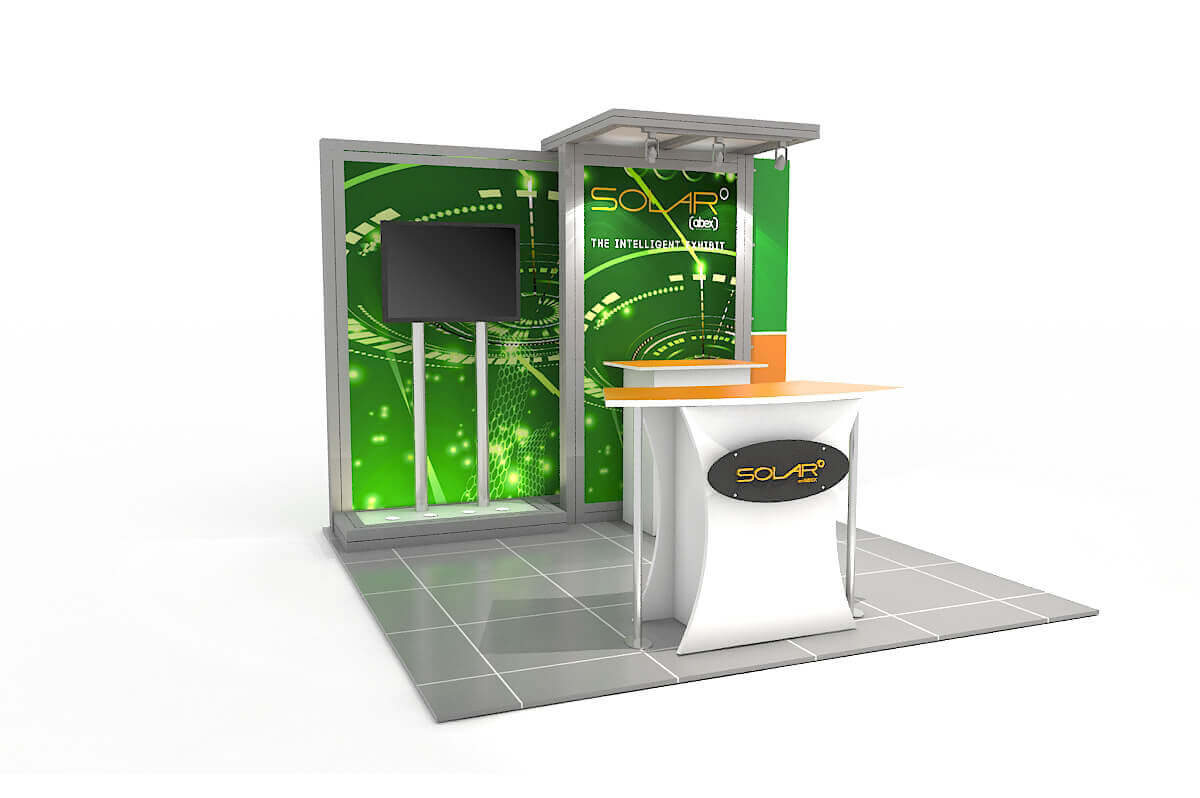
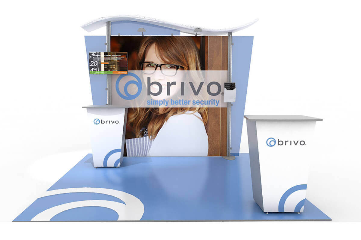
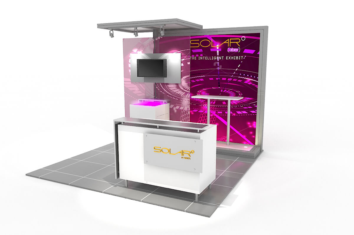
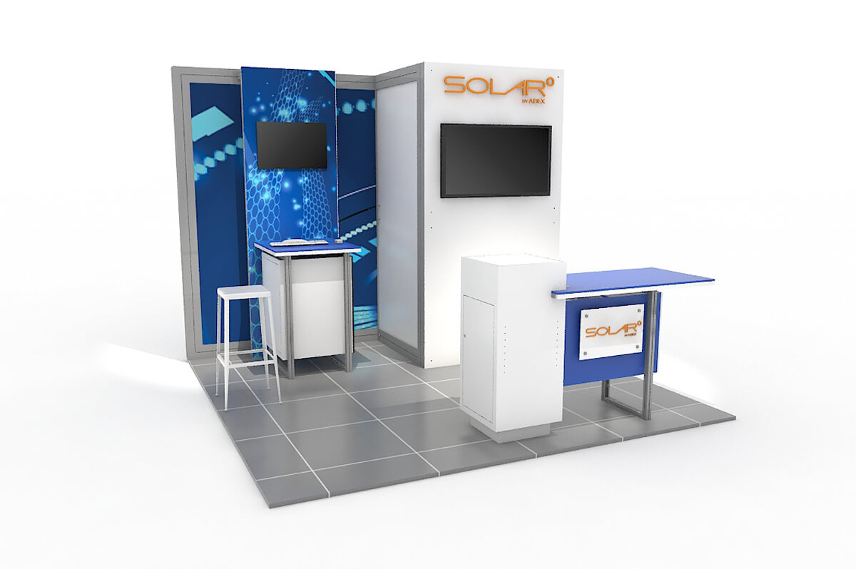
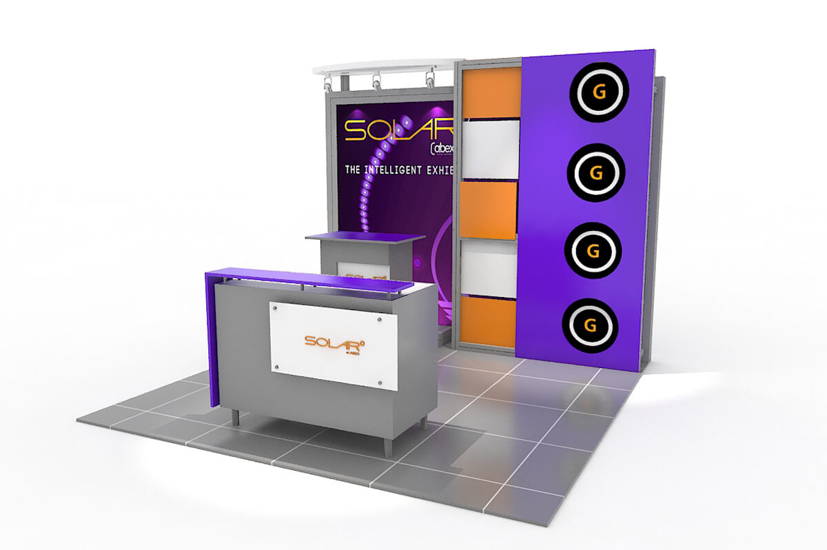
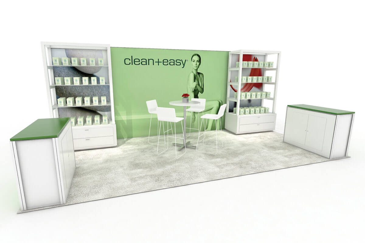
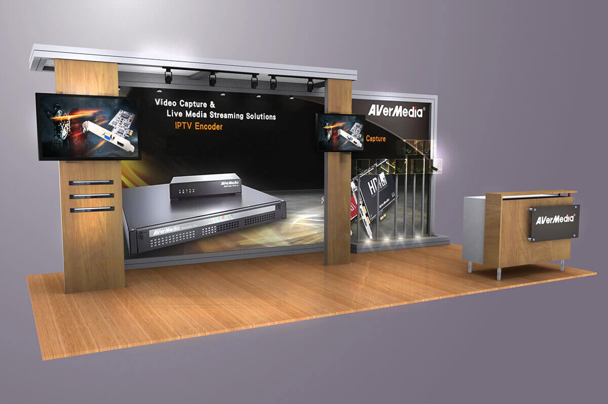
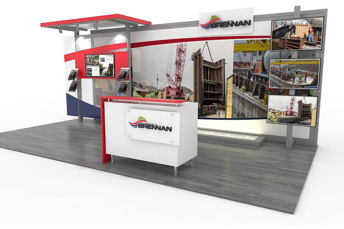
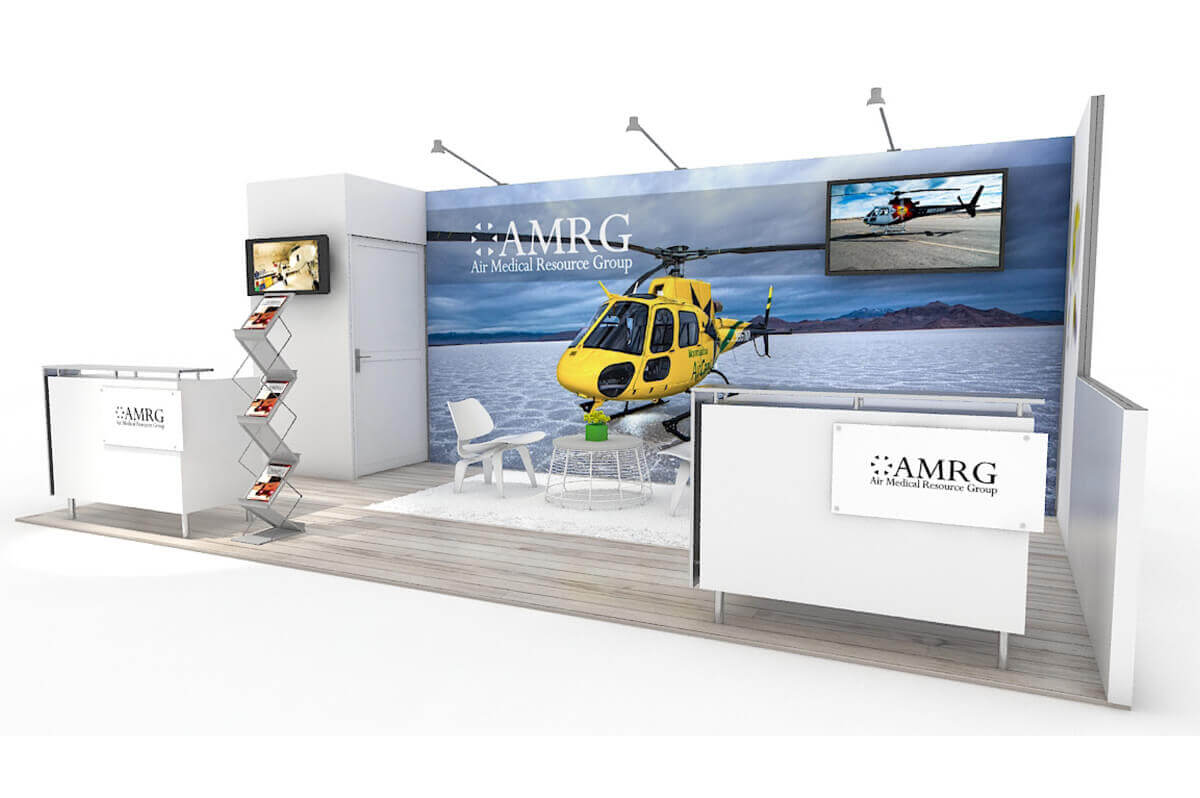
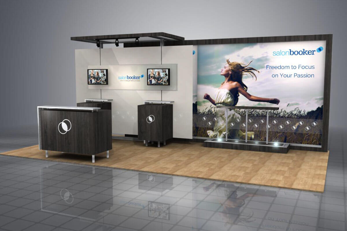
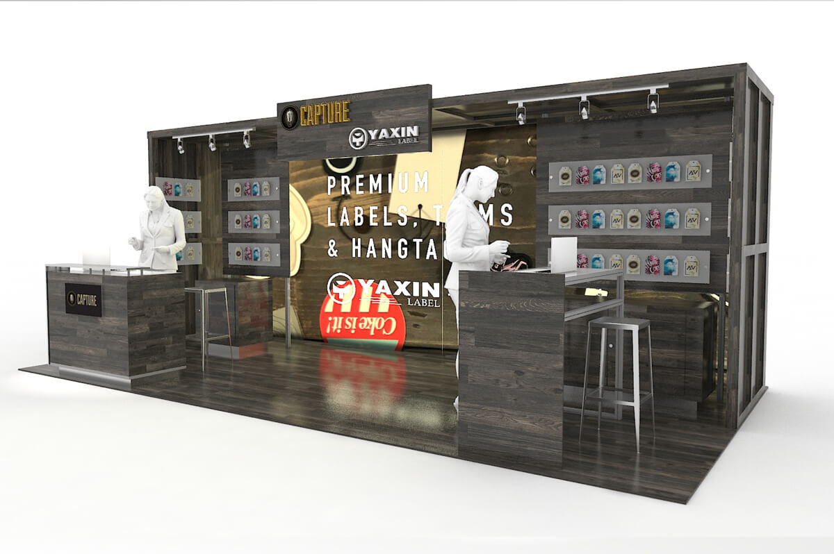
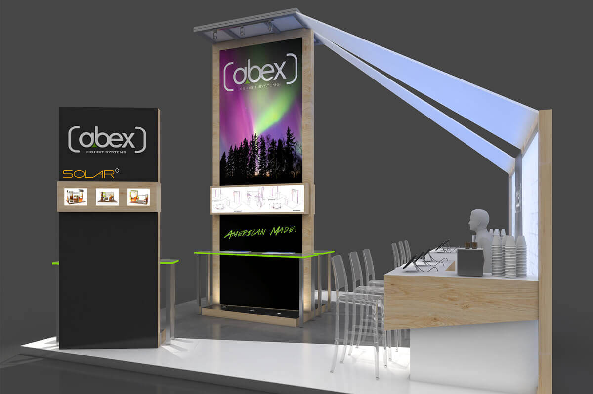
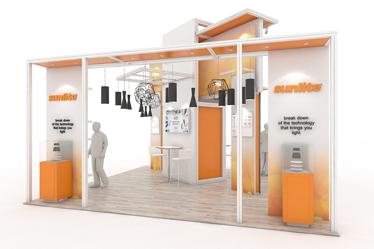
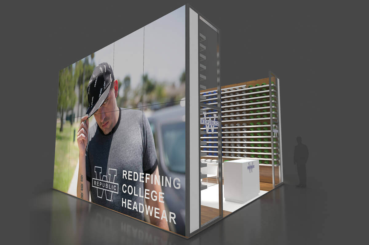
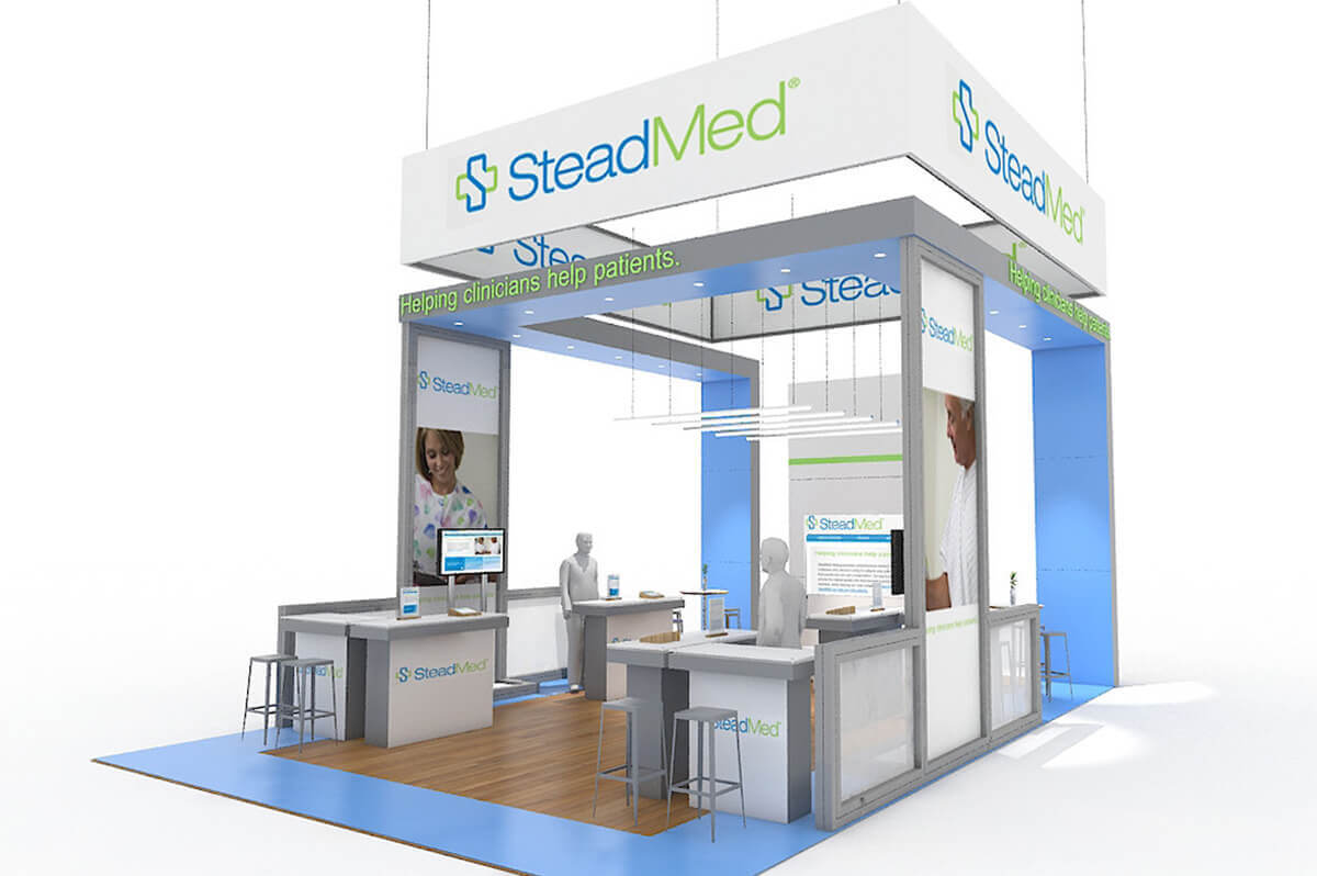
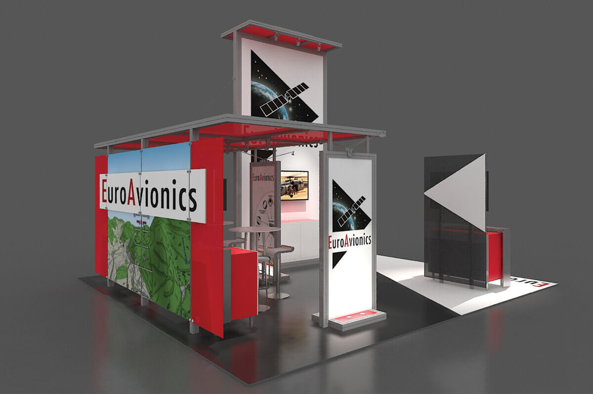
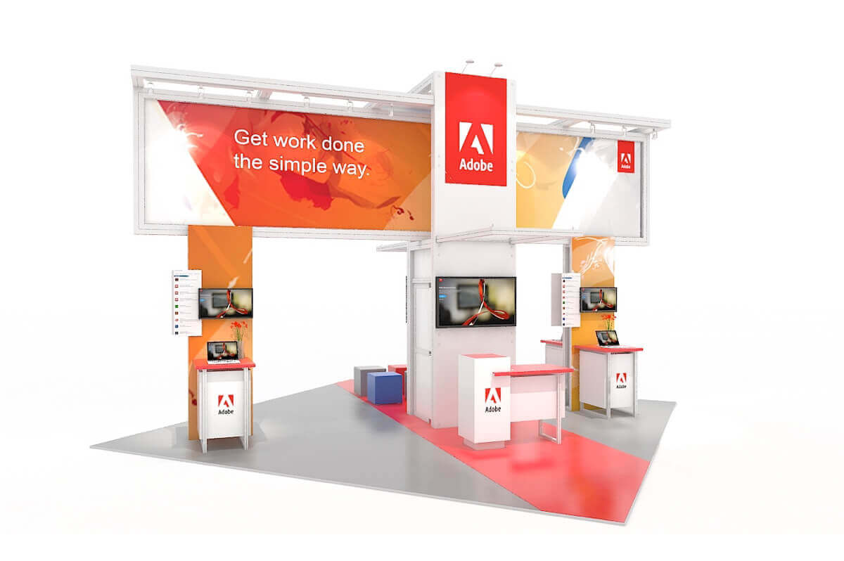
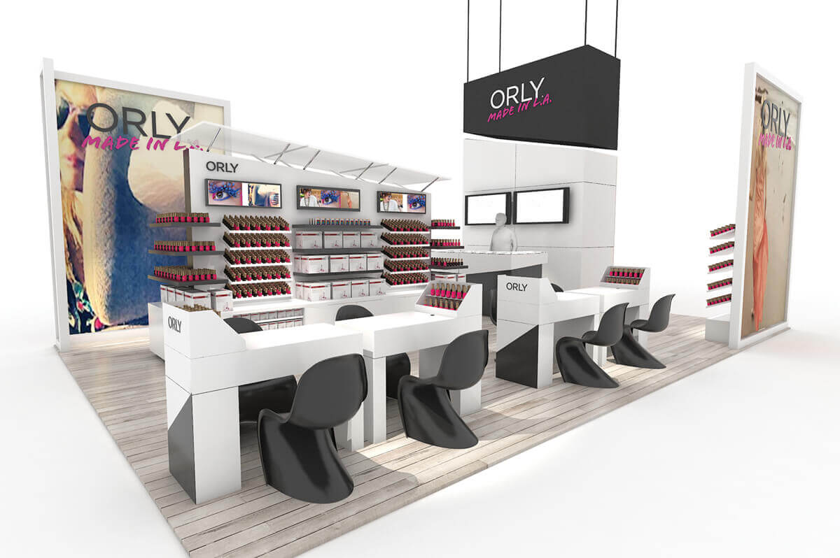
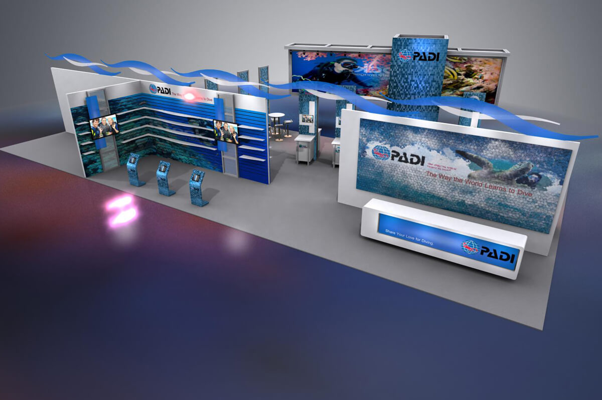
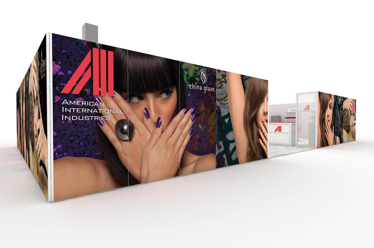
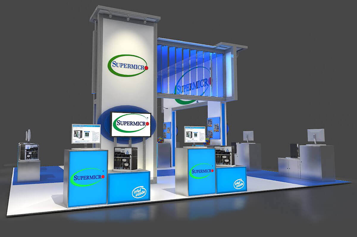
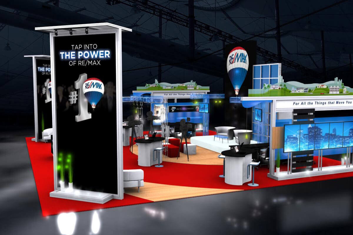
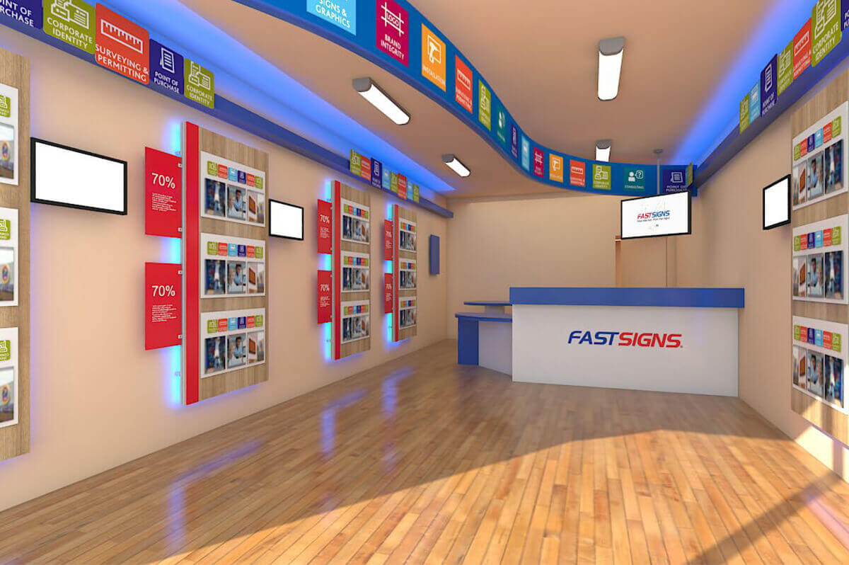
            <h5>Some of our latest project renderings</h5>


            <div class="responsive-tabs">

                <ul class="resp-tabs-list inline-list">

                    <li>10x10</li>

                    <li>10x20</li>

                    <li>20x20</li>

                    <li>20x30+</li>

                </ul>


                <div class="resp-tabs-container">


                    <!-- Magnific Popup Image -->

                    <div data-lightbox="gallery" class="row row-no-gutter offset-2 ">


                        <div class="col-xs-6 col-sm-4">

                            <a class="thumb" data-lightbox="image" href="images/10x10-1.jpg">

                                <img src="images/10x10-1-th.jpg" alt=""/>

                                <span class="thumb__overlay fa fa-search"></span>

                            </a>

                        </div>


                        <div class="col-xs-6 col-sm-4">

                            <a class="thumb" data-lightbox="image" href="images/10x10-2.jpg">

                                <img src="images/10x10-2-th.jpg" alt=""/>

                                <span class="thumb__overlay fa fa-search"></span>

                            </a>

                        </div>


                        <div class="col-xs-6 col-sm-4">

                            <a class="thumb" data-lightbox="image" href="images/10x10-3.jpg">

                                <img src="images/10x10-3-th.jpg" alt=""/>

                                <span class="thumb__overlay fa fa-search"></span>

                            </a>

                        </div>


                        <div class="col-xs-6 col-sm-4">

                            <a class="thumb" data-lightbox="image" href="images/10x10-4.jpg">

                                <img src="images/10x10-4-th.jpg" alt=""/>

                                <span class="thumb__overlay fa fa-search"></span>

                            </a>

                        </div>


                        <div class="col-xs-6 col-sm-4">

                            <a class="thumb" data-lightbox="image" href="images/10x10-5.jpg">

                                <img src="images/10x10-5-th.jpg" alt=""/>

                                <span class="thumb__overlay fa fa-search"></span>

                            </a>

                        </div>


                        <div class="col-xs-6 col-sm-4">

                            <a class="thumb" data-lightbox="image" href="images/10x10-6.jpg">

                                <img src="images/10x10-6-th.jpg" alt=""/>

                                <span class="thumb__overlay fa fa-search"></span>

                            </a>

                        </div>


                    </div>

                    <!-- END Magnific Popup Image -->


                    <!-- Magnific Popup Image -->

                    <div data-lightbox="gallery" class="row row-no-gutter offset-2">


                        <div class="col-xs-6 col-sm-4">

                            <a class="thumb" data-lightbox="image" href="images/10x20-1.jpg">

                                <img src="images/10x20-1-th.jpg" alt=""/>

                                <span class="thumb__overlay fa fa-search"></span>

                            </a>

                        </div>


                        <div class="col-xs-6 col-sm-4">

                            <a class="thumb" data-lightbox="image" href="images/10x20-2.jpg">

                                <img src="images/10x20-2-th.jpg" alt=""/>

                                <span class="thumb__overlay fa fa-search"></span>

                            </a>

                        </div>


                        <div class="col-xs-6 col-sm-4">

                            <a class="thumb" data-lightbox="image" href="images/10x20-3.jpg">

                                <img src="images/10x20-3-th.jpg" alt=""/>

                                <span class="thumb__overlay fa fa-search"></span>

                            </a>

                        </div>


                        <div class="col-xs-6 col-sm-4">

                            <a class="thumb" data-lightbox="image" href="images/10x20-4.jpg">

                                <img src="images/10x20-4-th.jpg" alt=""/>

                                <span class="thumb__overlay fa fa-search"></span>

                            </a>

                        </div>


                        <div class="col-xs-6 col-sm-4">

                            <a class="thumb" data-lightbox="image" href="images/10x20-5.jpg">

                                <img src="images/10x20-5-th.jpg" alt=""/>

                                <span class="thumb__overlay fa fa-search"></span>

                            </a>

                        </div>


                        <div class="col-xs-6 col-sm-4">

                            <a class="thumb" data-lightbox="image" href="images/10x20-6.jpg">

                                <img src="images/10x20-6-th.jpg" alt=""/>

                                <span class="thumb__overlay fa fa-search"></span>

                            </a>

                        </div>


                    </div>

                    <!-- END Magnific Popup Image -->


                    <!-- Magnific Popup Image -->

                    <div data-lightbox="gallery" class="row row-no-gutter offset-2">


                        <div class="col-xs-6 col-sm-4">

                            <a class="thumb" data-lightbox="image" href="images/20x20-1.jpg">

                                <img src="images/20x20-1-th.jpg" alt=""/>

                                <span class="thumb__overlay fa fa-search"></span>

                            </a>

                        </div>


                        <div class="col-xs-6 col-sm-4">

                            <a class="thumb" data-lightbox="image" href="images/20x20-2.jpg">

                                <img src="images/20x20-2-th.jpg" alt=""/>

                                <span class="thumb__overlay fa fa-search"></span>

                            </a>

                        </div>


                        <div class="col-xs-6 col-sm-4">

                            <a class="thumb" data-lightbox="image" href="images/20x20-3.jpg">

                                <img src="images/20x20-3-th.jpg" alt=""/>

                                <span class="thumb__overlay fa fa-search"></span>

                            </a>

                        </div>


                        <div class="col-xs-6 col-sm-4">

                            <a class="thumb" data-lightbox="image" href="images/20x20-4.jpg">

                                <img src="images/20x20-4-th.jpg" alt=""/>

                                <span class="thumb__overlay fa fa-search"></span>

                            </a>

                        </div>


                        <div class="col-xs-6 col-sm-4">

                            <a class="thumb" data-lightbox="image" href="images/20x20-5.jpg">

                                <img src="images/20x20-5-th.jpg" alt=""/>

                                <span class="thumb__overlay fa fa-search"></span>

                            </a>

                        </div>


                        <div class="col-xs-6 col-sm-4">

                            <a class="thumb" data-lightbox="image" href="images/20x20-6.jpg">

                                <img src="images/20x20-6-th.jpg" alt=""/>

                                <span class="thumb__overlay fa fa-search"></span>

                            </a>

                        </div>


                    </div>

                    <!-- END Magnific Popup Image -->


                    <!-- Magnific Popup Image -->

                    <div data-lightbox="gallery" class="row row-no-gutter offset-2">


                        <div class="col-xs-6 col-sm-4">

                            <a class="thumb" data-lightbox="image" href="images/20x30plus-1.jpg">

                                <img src="images/20x30plus-1-th.jpg" alt=""/>

                                <span class="thumb__overlay fa fa-search"></span>

                            </a>

                        </div>


                        <div class="col-xs-6 col-sm-4">

                            <a class="thumb" data-lightbox="image" href="images/20x30plus-2.jpg">

                                <img src="images/20x30plus-2-th.jpg" alt=""/>

                                <span class="thumb__overlay fa fa-search"></span>

                            </a>

                        </div>


                        <div class="col-xs-6 col-sm-4">

                            <a class="thumb" data-lightbox="image" href="images/20x30plus-3.jpg">

                                <img src="images/20x30plus-3-th.jpg" alt=""/>

                                <span class="thumb__overlay fa fa-search"></span>

                            </a>

                        </div>


                        <div class="col-xs-6 col-sm-4">

                            <a class="thumb" data-lightbox="image" href="images/20x30plus-4.jpg">

                                <img src="images/20x30plus-4-th.jpg" alt=""/>

                                <span class="thumb__overlay fa fa-search"></span>

                            </a>

                        </div>


                        <div class="col-xs-6 col-sm-4">

                            <a class="thumb" data-lightbox="image" href="images/20x30plus-5.jpg">

                                <img src="images/20x30plus-5-th.jpg" alt=""/>

                                <span class="thumb__overlay fa fa-search"></span>

                            </a>

                        </div>


                        <div class="col-xs-6 col-sm-4">

                            <a class="thumb" data-lightbox="image" href="images/20x30plus-6.jpg">

                                <img src="images/20x30plus-6-th.jpg" alt=""/>

                                <span class="thumb__overlay fa fa-search"></span>

                            </a>

                        </div>


                    </div>

                    <!-- END Magnific Popup Image -->


                    <!-- Magnific Popup Image -->

                    <div data-lightbox="gallery" class="row row-no-gutter offset-2">


                    </div>

                    <!-- END Magnific Popup Image -->


                </div>

            </div>


        </section>

        <!-- END section latest and greatest-->


        <!-- section move to modular-->

        <section class="well-sm well-sm--inset-2 bg-primary bg-image-2">

            <div class="container">

            <center>

                <h2>move to modular</h2>

                <hr/>

                <h5>Understanding why to build modular</h5>

                <div class="row offset-3 text-sm-center">

                    <div class="col-md-3 col-sm-6">

                        <span class="icon icon-lg text-bold fa-balance-scale icon-mod-1"></span>

                        <h6><a href="#">Less Weight</a></h6>


                        <p>Let us help you design and build an exhibit that is easy to take from show to show, at as little as 1/3 of the comparable weight of a custom exhibit. This allows you to minimize non-marketing related expenses like shipping and drayage.</p>

                    </div>

                    <div class="col-md-3 col-sm-6">

                        <span class="icon icon-lg text-bold home fa-expand icon-mod-1"></span>

                        <h6><a href="#">Reconfigurable</a></h6>


                        <p>We pride ourselves in the ability to design a custom modular exhibit that can be reconfigured for a 10x10, 10x20, 20 x 20 or larger booth space, or whatever your next show requires.</p>

                    </div>

                    <div class="col-md-3 col-sm-6">

                        <span class="icon icon-lg text-bold fa-cubes icon-mod-1"></span>

                        <h6><a href="#">Easy Setup</a></h6>


                        <p>Streamlined Set up and Dismantle. Numbered components and corresponding numbered instructions and packing reduce self-install time or show labor requirements. Many of our extrusion and panel systems can be easily set up by one or two staff members in less than two hours.</p>

                    </div>

                    <div class="col-md-3 col-sm-6 inset-1">

                        <span class="icon icon-lg text-bold fa-picture-o icon-mod-1"></span>

                        <h6 class="offset-5"><a href="#">Design/Graphics</a></h6>


                        <p>Our team of exhibit designers and experienced graphic artists are ready to go above and beyond in creating graphics that suit your brand's needs and an exhibit concept that has functionality and flexibility.</p>

                    </div>

                </div>

                <a class="btn btn-primary btn-md " href="movetomodular.html">Move to Modular</a>

                </center>


            </div>

        </section>

        <!-- END section move to modular-->


        <!-- section brands -->


        <section class="bg-primary bg-image bg-image-5 well-sm well-sm--inset-2">

                <h2>Some of our Clients</h2>

                <hr/>

                <h5>These are some of the companies we are proud to work with and help further their brand's image on the trade show floor.</h5>

                <div class="col-sm-12">

                <img src="images/abex-customers.png">

                </div>


        </section>


        <!-- END section instagram-->


        <!-- parallax -->

        <section class="rd-parallax">

            <div class="rd-parallax-layer bg-overlay" data-speed="1" data-type="media"

                 data-url="images/parallax2.jpg"></div>

            <div class="rd-parallax-layer" data-speed="0.3" data-type="html" data-direction="inverse">

                <div class="container well-xl z-index">

                    <div class="row text-sm-left">

                        <div class="col-sm-12">

                        <center>

                            <h2>CUSTOM</h2>

                            <hr/>

                            <h6>Custom Exhibit Design</h6>


                            <h7 class="inset-2">We love designing custom modular exhibits. From a wide range of materials and lightweight aluminum extrusions, we take pride in the ability to design and fabricate a fully custom modular solution tailored to your brand, requirements, and required functionality be it an in booth presentation theatre, private or semi-private meeting rooms, interactive kiosks, and more.  Whether for a highly competitive trade show, retail space, or a private event, our exhibit designers understand what draws attention to your booth and what propels interaction. We design attraction, involvement, and engagement into every modular exhibit system we build.</h7>

                            <a class="btn btn-primary btn-md" href="capabilities.html">Our Capabilities</a>

                            </center>

                        </div>

                    </div>

                </div>

            </div>

        </section>

        <!-- END parallax -->


        <!-- section newsletter -->

        <section class="bg-primary bg-image bg-image-3 well-sm well-sm--inset-2">

            <div class="container">

                <!--<h2>keep up with us</h2>

                <hr/>-->

                        <!--Begin CTCT Sign-Up Form-->

<!-- EFD 1.0.0 [Mon Mar 06 20:31:27 EST 2017] -->

<link rel='stylesheet' type='text/css' href='https://static.ctctcdn.com/h/contacts-embedded-signup-assets/1.0.2/css/signup-form.css'>

<style type="text/css">

	.ctct-custom-form .ctct-form-required:before {

    display: none;

	}

	.ctct-custom-form .ctct-button:hover {

    color: #fff;

		background-color: #333;

	}

	.ctct-custom-form .ctct-button {

    color: #000;

    background-color: #81bc00;

    display: block;

    width: 50%;

	margin-left: auto;

	margin-right: auto;

	}

	.ctct-custom-form input[type="text"] {

    width: 50%;

    padding: 10px 15px;

    border: 1px solid #b0b6bb;

    border-radius: 4px;

    box-shadow: inset 0 1px 2px rgba(0, 0, 0, 0.1);

    font-family: Helvetica Neue, Arial, sans-serif;

    color: #394856;

    font-size: 16px;

    line-height: 1.5;

}


				</style>

<div class="ctct-embed-signup" style="font: 16px Helvetica Neue, Arial, sans-serif; font: 1rem Helvetica Neue, Arial, sans-serif; line-height: 1.5; -webkit-font-smoothing: antialiased;">

   <div style="color:#FFFFFF; background-color:#000000; border-radius:10px; padding-top: 20px; padding-bottom: 20px; max-width: 1000px; margin-left: auto; margin-right: auto;">

       <span id="success_message" style="display:none;">

           <div style="text-align:center;">Thanks for signing up!</div>

       </span>

       <form data-id="embedded_signup:form" class="ctct-custom-form Form" name="embedded_signup" method="POST" action="https://visitor2.constantcontact.com/api/signup">

           <h2>Keep up with us!</h2>

           <hr>

           <h5>Subscribe to our mailing list</h5>

           <br>

           <br>

           <!-- The following code must be included to ensure your sign-up form works properly. -->

           <input data-id="ca:input" type="hidden" name="ca" value="0605f753-1e3f-4715-bfac-a80dd1d8473a">

           <input data-id="list:input" type="hidden" name="list" value="1570153874">

           <input data-id="source:input" type="hidden" name="source" value="EFD">

           <input data-id="required:input" type="hidden" name="required" value="list,email,first_name">

           <input data-id="url:input" type="hidden" name="url" value="">

           <p data-id="Email Address:p" ><label data-id="Email Address:label" data-name="email" class="ctct-form-required">Email Address</label> <input data-id="Email Address:input" type="text" name="email" value="" maxlength="80"></p>

           <p data-id="First Name:p" ><label data-id="First Name:label" data-name="first_name" class="ctct-form-required">First Name</label> <input data-id="First Name:input" type="text" name="first_name" value="" maxlength="50"></p>

           <button type="submit" class="Button ctct-button Button--block Button-secondary" data-enabled="enabled">Sign Up</button>


       </form>

   </div>

</div>

<script type='text/javascript'>

   var localizedErrMap = {};

   localizedErrMap['required'] = 		'This field is required.';

   localizedErrMap['ca'] = 			'An unexpected error occurred while attempting to send email.';

   localizedErrMap['email'] = 			'Please enter your email address in name@email.com format.';

   localizedErrMap['birthday'] = 		'Please enter birthday in MM/DD format.';

   localizedErrMap['anniversary'] = 	'Please enter anniversary in MM/DD/YYYY format.';

   localizedErrMap['custom_date'] = 	'Please enter this date in MM/DD/YYYY format.';

   localizedErrMap['list'] = 			'Please select at least one email list.';

   localizedErrMap['generic'] = 		'This field is invalid.';

   localizedErrMap['shared'] = 		'Sorry, we could not complete your sign-up. Please contact us to resolve this.';

   localizedErrMap['state_mismatch'] = 'Mismatched State/Province and Country.';

	localizedErrMap['state_province'] = 'Select a state/province';

   localizedErrMap['selectcountry'] = 	'Select a country';

   var postURL = 'https://visitor2.constantcontact.com/api/signup';

</script>

<script async type='text/javascript' src='/js/signup-form.js'></script>

<!--End CTCT Sign-Up Form-->

                    </div>

        </section>

        <!-- END section newsletter-->


        <!-- section instagram

        <script type="text/javascript">
    var userFeed = new Instafeed({
        get: 'user',
        userId: 2959753655,
        accessToken: '2959753655.1677ed0.1a6b47bfa13e4dcba0143aa66e3ffd53',
      resolution: 'low_resolution',
      limit: 5

    });
    userFeed.run();
</script>

        <section class="bg-primary bg-image bg-image-4 well-sm well-sm--inset-2">
                <h2>instagram</h2>
                <hr/>
                <div id="insta-wrap">
   <div id="instafeed">

            </div>
    <div class="follow">follow us on Instagram: <a target="_blank" href="https://www.instagram.com/abexexhibits/">@abexexhibits</a></div>
</div>
        </section>

        <!-- END section instagram-->

    </main>

    <!--========================================================

                              FOOTER

    ==========================================================-->

    <footer class="page-footer text-center">

        <!-- section7 -->

        <section class="well-md">

            <div class="container">


                <h2>contact us</h2>

                <hr/>

                <div class="row">

                    <div class="col-xs-4">

                        <span class="icon icon-md icon-primary fl-continuous-house150"></span>

                        <address>

                            <a href="">355 Parkside Dr,<br>

                                San Fernando, CA 91340</a>

                        </address>

                    </div>

                    <div class="col-xs-4 inset-3">

                        <span class="icon icon-xs icon-primary fa fa-phone mob"></span>


                        <p><a href="callto:8005370231">+1 800 537 0231</a></p>

                    </div>

                    <div class="col-xs-4">

                        <span class="icon icon-md icon-primary fl fl-continuous-envelope42"></span>


                        <p><a href="mailto:info@abex.com">info@abex.com</a></p>

                    </div>

                </div>


                <p class="copyright">

                    Abex Exhibits © <span id="copyright-year"></span>

                    All rights reserved  |  ASI #30370  |  SAGE #68697  |  PPAI #429356  |

                </p>

            </div>

        </section>

        <!-- END section7-->


        <!-- RD Google Map -->

        <div class="rd-google-map">

            <div id="google-map" class="rd-google-map__model"></div>

            <ul class="rd-google-map__locations">

                    <li data-x="-118.4340025" data-y="34.2812158" data-basic="images/gmap_park.png"

                    data-active="images/gmap_park_active.png">

                        <p> 355 Parkside Dr, San Fernando CA 91340. <span>800-537-0231</span></p>

                </li>

                    <li data-x="-118.4340025" data-y="34.2812158">

                        <p> 355 Parkside Dr, San Fernando CA 91340. <span>800-537-0231</span></p>

                </li>

                    <li data-x="-118.4340025" data-y="34.2812158" data-basic="images/gmap_cart.png"

                    data-active="images/gmap_cart_active.png">

                        <p> 355 Parkside Dr, San Fernando CA 91340. <span>800-537-0231</span></p>

                </li>

            </ul>

        </div>

        <!-- END RD Google Map -->

    </footer>

</div>


<!-- Core Scripts -->

<script src="js/core.min.js"></script>

<!-- Additional Functionality Scripts -->

<script src="js/script2.js"></script>


<!-- Instagram Feed -->

<script async type="text/javascript" src="js/instafeed.min.js"></script>


<script>

$(document).ready(function() {

	$('.popup-youtube').magnificPopup({

		disableOn: 700,

		type: 'iframe',

		mainClass: 'mfp-fade',

		removalDelay: 160,

		preloader: false,


		fixedContentPos: false

	});

});

</script>

</body>

</html>