﻿<!DOCTYPE html>
<html lang="en" class="wide wow-animation smoothscroll">
<head>
    <!-- Site Title -->
    <title>ABEX Exhibit Systems</title>
    <meta name="format-detection" content="telephone=no"/>
    <meta name="viewport"
          content="width=device-width, height=device-height, initial-scale=1.0, maximum-scale=1.0, user-scalable=0"/>

    <!-- Stylesheets -->
    <link rel="icon" href="images/favicon.ico" type="image/x-icon">
    <link href='//fonts.googleapis.com/css?family=Ubuntu:500%7CRoboto:100,300,500,400,700,700italic' rel='stylesheet'
          type='text/css'>
    <link rel="stylesheet" href="css/style.css">
    <link rel="stylesheet" href="css/mailform-sub.css">

    <!--[if lt IE 10]>
    <div style='background: #212121; padding: 10px 0; box-shadow: 3px 3px 5px 0 rgba(0,0,0,.3); clear: both; text-align:center; position: relative; z-index:1;'>
        <a href="http://windows.microsoft.com/en-US/internet-explorer/..">
            <img src="images/ie8-panel/warning_bar_0000_us.jpg" border="0" height="42" width="820"
                 alt="You are using an outdated browser. For a faster, safer browsing experience, upgrade for free today."/>
        </a>
    </div>
    <script src="js/html5shiv.min.js"></script>
    <![endif]-->
    
    <!-- Instagram Feed -->
    <script type="text/javascript" src="js/instafeed.min.js"></script>

</head>
<body>
<!-- The Main Wrapper -->
<div class="page">
    <!--========================================================
                              HEADER
    =========================================================-->
    <header class="page-header">
        <!-- RD Navbar -->
        <div class="rd-navbar-wrap rd-navbar-wrap-variant-1">
            <nav class="rd-navbar" data-rd-navbar-lg="rd-navbar-static">
                <div class="rd-navbar-inner">
                    <!-- RD Navbar Panel -->
                    <div class="rd-navbar-panel">

                        <!-- RD Navbar Toggle -->
                        <button class="rd-navbar-toggle" data-rd-navbar-toggle=".rd-navbar"><span></span></button>
                        <!-- END RD Navbar Toggle -->

                        <!-- RD Navbar Brand -->
                        <div class="rd-navbar-brand">
                            <a href="index.html" class="brand-name primary-color">
                                <img src="http://www.abex.com/newsite/images/abex-302px.png">
                            </a>
                        </div>
                        <!-- END RD Navbar Brand -->
                    </div>
                    <!-- END RD Navbar Panel -->

                    <div class="rd-navbar-nav-wrap">

                        <!-- RD Navbar Nav -->
                        <ul class="rd-navbar-nav">
                            <li>
                                <a href="about.html">About</a>

                                <!-- RD Navbar Dropdown -->
                                <ul class="rd-navbar-dropdown">
                                    <li>
                                        <a href="news.html">Blog</a>
                                    </li>
                                    <li>
                                        <a href="storyofabex.html">Our Story</a>
                                    </li>
                                    <li>
                                        <a href="capabilities.html">Capabilities</a>
                                        <ul class="rd-navbar-dropdown">
                                            <li>
                                                <a href='capabilities.html'>Portable</a>
                                            </li>
                                            <li>
                                                <a href='capabilities.html'>Custom</a>
                                            </li>
                                            <li>
                                                <a href='capabilities.html'>Smart Exhibits</a>
                                            </li>
                                            <li>
                                                <a href='capabilities.html'>Design</a>
                                            </li>
                                        </ul>
                                    </li>
                                    <li>
                                        <a href="factory.html">Factory</a>
                                    </li>
                                    <li>
                                        <a href="movetomodular.html">Modular</a>
                                    </li>
                                    <li>
                                        <a href="success.html">Success Stories</a>
                                    </li>
                                </ul>
                                <!-- END RD Navbar Dropdown -->

                            </li>
                            <li>
                                <a href="exhibitsearch.html">Exhibit Search</a>
                            </li>
                            <li>
                                <a href="products.html">Products</a>
                            </li>
                            <li>
                                <a href="http://www.abexonline.com">Login</a>
                            </li>
                            <li>
                                <a href="contact.html">Contact</a>
                            </li>
                            <li>
                            <a href="http://www.facebook.com/abexexhibits"><span class="fa-facebook"></span></a>
                            </li>
                            <li>
                            <a href="http://www.twitter.com/abexexhibits"><span class="fa-twitter"></span></a>
                            </li>
                            <li>
                            <a href="http://www.instagram.com/abexexhibits"><span class="fa-instagram"></span></a>
                            </li>
                        </ul>
                        <!-- END RD Navbar Nav -->
                    </div>
                </div>
            </nav>
        </div>
        <!-- END RD Navbar -->

        <!-- Swiper -->
        <div class="swiper-container swiper-slider" data-height="100vh" data-min-height="300px"
             data-slide-effect="fade">
            

            <div class="swiper-wrapper">

<style>

/* Text Overlay */


#lab_video_text_overlay {
  position: absolute;
  width: 100%;
  top: 0;
z-index:99;
}

.slider-video { 
    position: fixed;
    top: 50%;
    left: 50%;
    min-width: 100%;
    min-height: 100%;
    width: auto;
    height: auto;
    z-index: -100;
    -ms-transform: translateX(-50%) translateY(-50%);
    -moz-transform: translateX(-50%) translateY(-50%);
    -webkit-transform: translateX(-50%) translateY(-50%);
    transform: translateX(-50%) translateY(-50%);
    background: url(polina.jpg) no-repeat;
    background-size: cover; 
}

</style>
<div class="swiper-slide bg-overlay" data-autoplay="20000">


	<div id="lab_video_text_overlay">
		<div class="container" style="height: 100vh;"> 
        <div class="swiper-slide-caption fadeIn z-index">
			<h2>DESIGN FORWARD</h2>
            <a href="https://www.youtube.com/watch?v=pcVqIHB3Ukw" class="btn btn-md btn-primary popup-youtube">WATCH VIDEO</a>
            </div>
		</div>
	</div>
	<!-- end #lab_overlay -->
	
	<video id="ccvideo" class="slider-video" width="100%" preload="auto" muted loop autoplay poster="images/rotomolding-ss.jpg">
		<source type="video/mp4" src="videos/IMG_0171.mp4">
		<source src="videos/IMG_0171.mp4" type="video/mp4">
		<source src="//dl.dropbox.com/s/79msa1jcni374v8/lab-coding.webm" type="video/webm">
		<source src="//dl.dropbox.com/s/7bq2tyma5de88bt/lab-coding.ogg" type="video/ogg">
	</video>
    
</div>
                <div class="swiper-slide bg-overlay" data-slide-bg="images/maximum-games.jpg">
                    <div class="container" style="height: 100vh;">
                        <div class="swiper-slide-caption fadeIn z-index">
                        <h2>Let us design your best exhibit.</h2>
                            <a href="#" class="btn btn-md btn-primary">Learn more</a>
                        </div>
                    </div>
                </div>
                <div class="swiper-slide bg-overlay" data-slide-bg="images/american-intl.jpg">
                    <div class="container" style="height: 100vh;">
                        <div class="swiper-slide-caption fadeIn z-index">
                        <h2>Design that leads to success.</h2>
                            <a href="#" class="btn btn-md btn-primary">Learn more</a>
                        </div>
                    </div>
                </div>
                           
                <div class="swiper-slide bg-overlay" data-slide-bg="images/vigor.jpg">
                    <div class="container" style="height: 100vh;">
                        <div class="swiper-slide-caption fadeIn z-index">
                        <h2>Don't just show up. Show Off.</h2>
                            <a href="#" class="btn btn-md btn-primary">Learn more</a>
                        </div>
                    </div>
                </div>
                
                <div class="swiper-slide bg-overlay" data-slide-bg="images/american-plating.jpg">
                    <div class="container" style="height: 100vh;">
                        <div class="swiper-slide-caption fadeIn z-index">
                        <h2>Don't just show up. Show Off.</h2>
                            <a href="#" class="btn btn-md btn-primary">Learn more</a>
                        </div>
                    </div>
                </div>
                
                <div class="swiper-slide bg-overlay" data-slide-bg="images/remax.jpg">
                    <div class="container" style="height: 100vh;">
                        <div class="swiper-slide-caption fadeIn z-index">
                        <h2>Don't just show up. Show Off.</h2>
                            <a href="#" class="btn btn-md btn-primary">Learn more</a>
                        </div>
                    </div>
                </div>

            </div>
            <!--<a href="#" class="btn btn-md btn-primary">Read more</a>-->

            <!-- Swiper Navigation -->
            <div class="swiper-button-prev">
                <span class="arrows-previous11"></span>
            </div>
            <div class="swiper-button-next">
                <span class="arrows-next15"></span>
            </div>

        </div>
        <!-- END Swiper -->
    </header>
    <!--========================================================
                              CONTENT
    =========================================================-->
    <main class="page-content text-center">

        <!-- section welcome -->
        <section class="well-sm bg-primary bg-image bg-image-1">
            <div class="container">
            <center>
                <h2>Welcome to Abex</h2>
                <hr/>
                <div class="row text-sm-left">
                    <div class="col-sm-4">
                    <center>
                    <h6>Two words: Quality Built.</h6>
                        <p>We can't take rejection. But our displays can take everything else you dish out. We manufacture our own products - even our cases! We offer flexible, durable and easily reconfigured solutions with precision manufacturing standards, rigorous quality assurance and Super-durable Abex "Show Quality" construction.</p>
                        </center>
                    </div>
                    <div class="col-sm-4">
                    <center>
                    <h6>How do we know?</h6>
                        <p>We build them ourselves from the ground up. At Abex, we manufacture virtually every component ourselves to the most exacting standards. We call it Abex Show Quality Construction. Made in the United States by skilled craftsmen utilizing the finest materials and components, Abex panels are constructed of aluminum TIG-welded frames and high-density infill for maximum strength and stability. We even manufacture our own exhibit cases and assemble every exhibit before it leaves our facility to assure you of trouble-free set-up and tear-down on the show floor, which in turn adds years to the life of your exhibit.</p>
                        </center>
                    </div>
                    <div class="col-sm-4">
                    <center>
                    <h6>We design it. We build it. And we mean it.</h6>
                        <p>At a show, you don't last unless you can take the pain. Brutal shipping, unfriendly loading docks. Set it up and tear it down. City after City. Do enough of it, and you'll see why you need a company and an exhibit you can depend on. You can rely on 35+ years of Abex engineering innovation to deliver the high-visibility and high-quality presentation your trade show schedule demands. Show after show, year after year. You'll also enjoy knowing that every Abex exhibit is backed by one of the most comprehensive warranty programs in the business along with a worldwide network of Abex distributors.</p>
                        </center>
                    </div>
                </div>

                <a class="btn btn-md btn-primary" href="storyofabex.html">Read More</a>
                </center>

            </div>
        </section>
        <!-- END section welcome-->

        <!-- section MODULAR -->
        <section class="rd-parallax text-sm-left">
            <div class="rd-parallax-layer bg-overlay2" data-speed="1" data-type="media"
                 data-url="images/parallax1.jpg"></div>
            <div class="rd-parallax-layer" data-speed="0.2" data-type="html" data-direction="inverse"
                 style="position: relative;">
                <div class="container well-xl z-index">
                <center>
                    <h2>MODULAR</h2>
                    <hr/>
                    <div class="row">
                        <div class="col-sm-12">
                            <h6>WHY CHOOSE MODULAR?</h6>
                            <br>
                            <br>
                            <h7 class="inset-2">
Unlike most custom displays which are made of wood, our Modular Exhibits are primarily made of lightweight aluminum. This means you arrive at the convention hall with much less weight and therefore, saving in shipping and drayage. The other advantage of going Modular is more flexibility reusability than other Custom Exhibits. By building with lightweight aluminum extrusions, these exhibits can be reconfigured between each show to accommodate different booth sizes, graphic needs, messaging and branding.
                            
                            </h7>
                            <a class="btn btn-md btn-primary" href="#">Read More</a>
                        </div>
                    </div>
                    </center>
                </div>
            </div>

        </section>
        <!-- END section MODULAR-->

        <!-- section latest and greatest -->
        <section class="bg-primary bg-image bg-image-2 well-sm well-sm--inset-1">

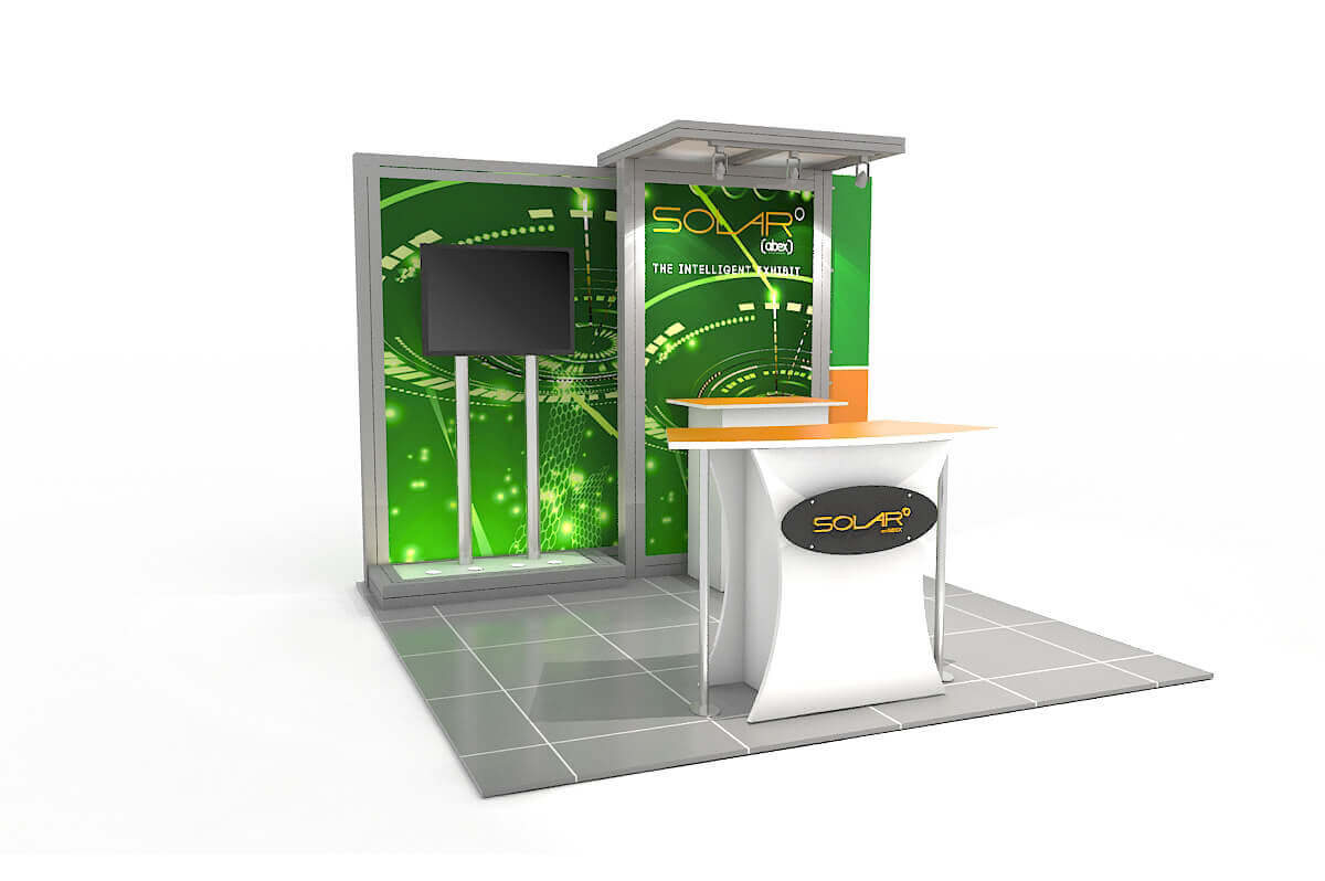
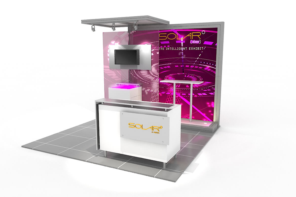
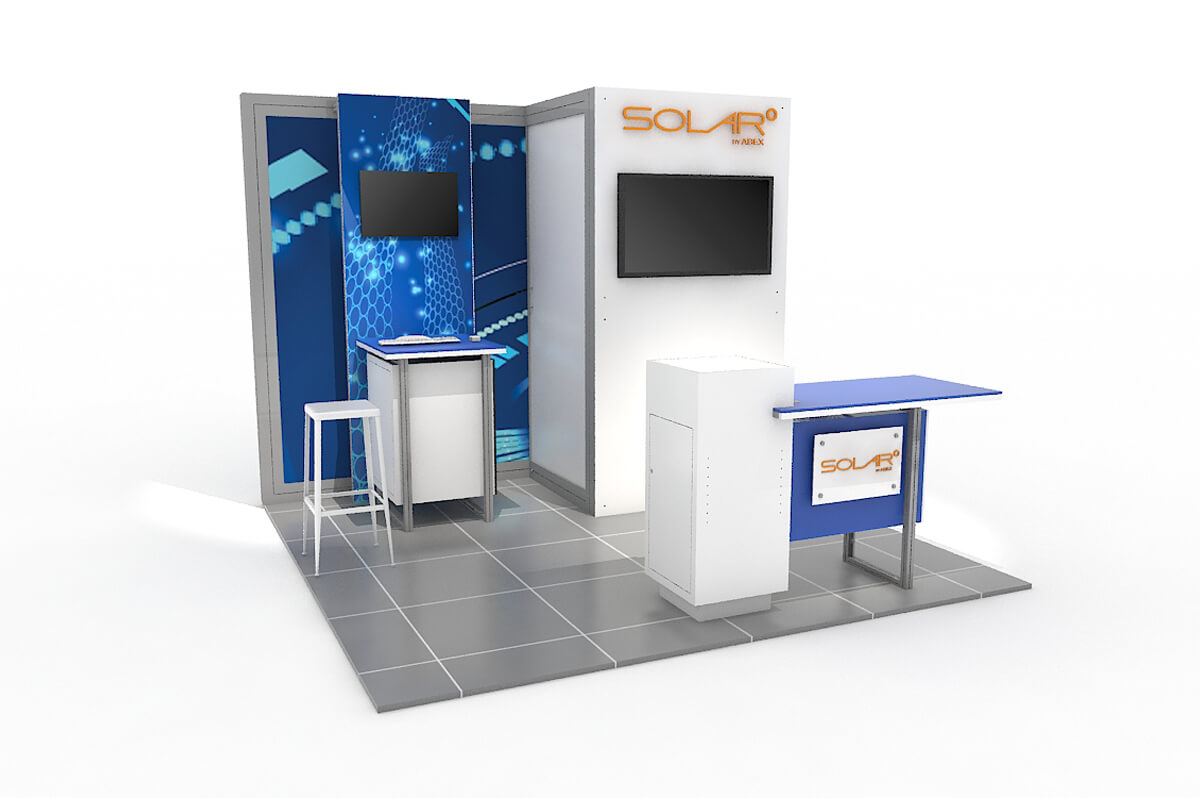
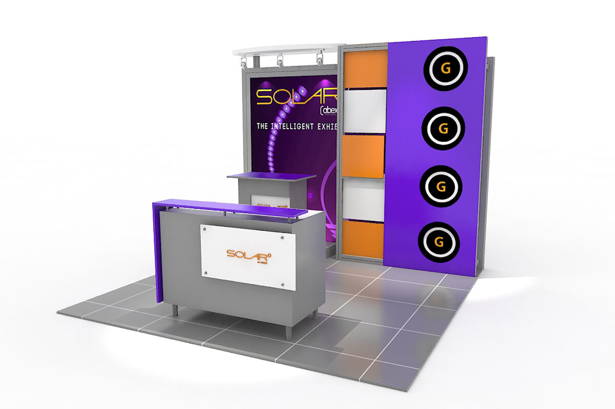
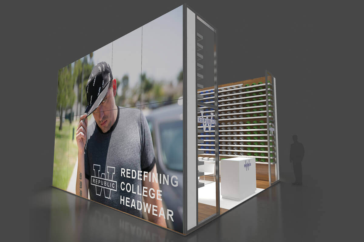
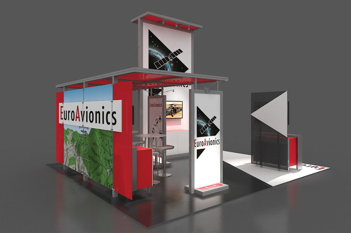
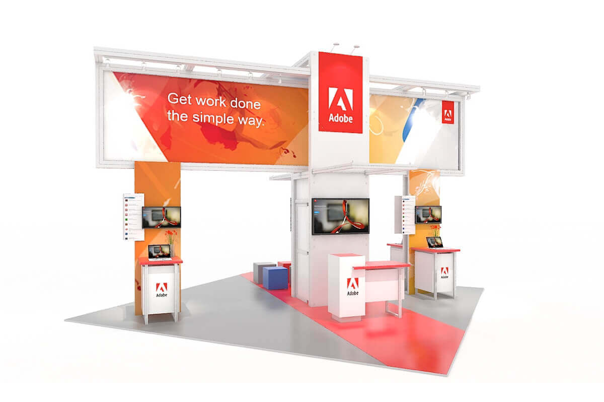
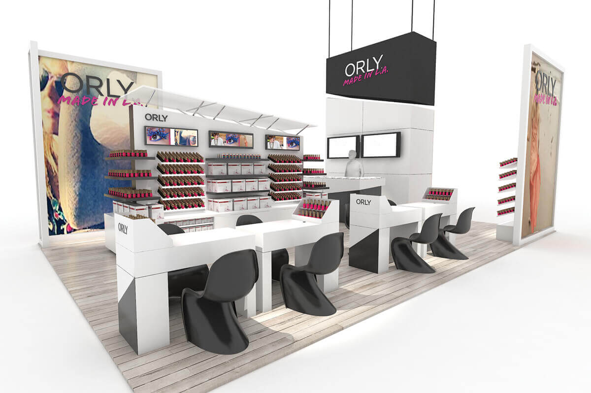
            <h2>Latest and Greatest</h2>
            <hr/>


            <div class="responsive-tabs">
                <ul class="resp-tabs-list inline-list">
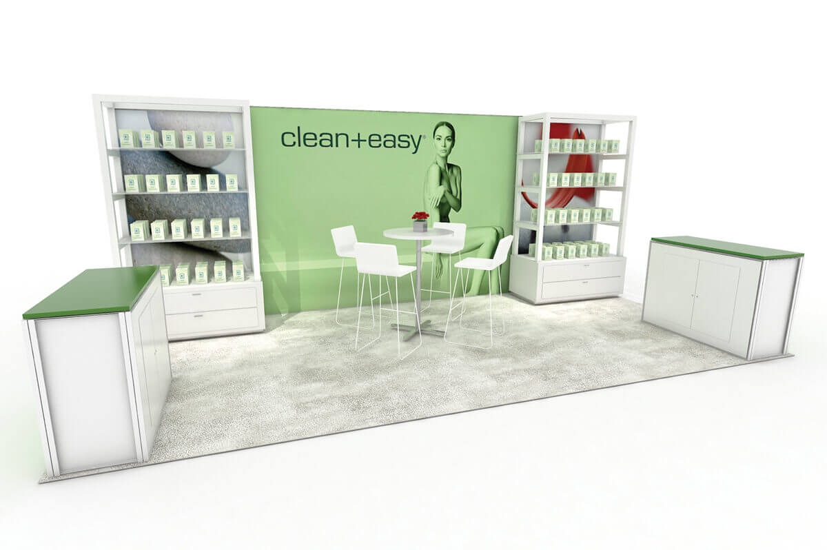
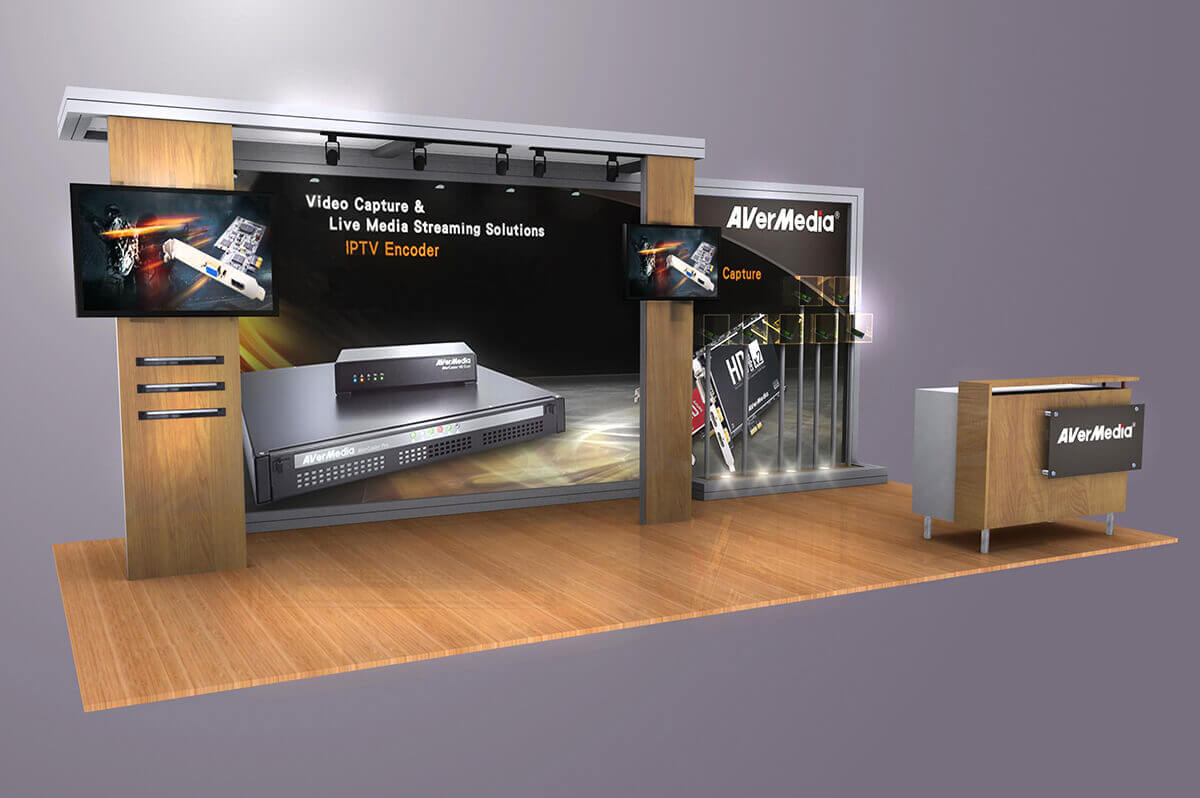
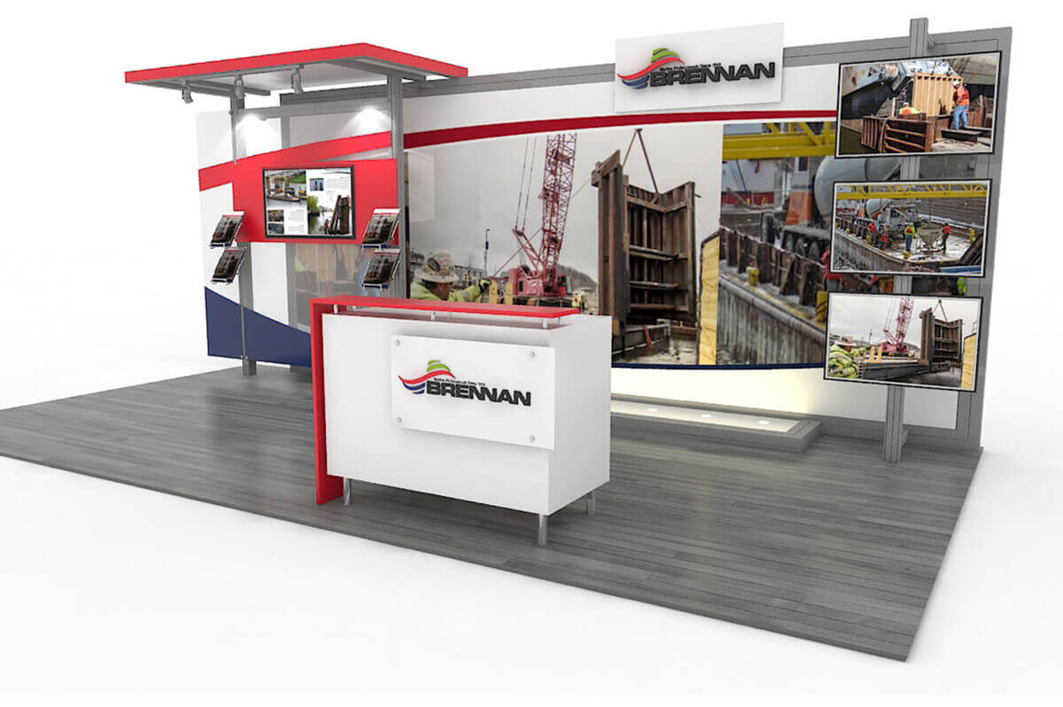
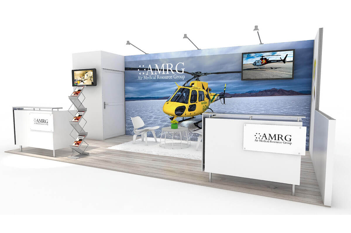
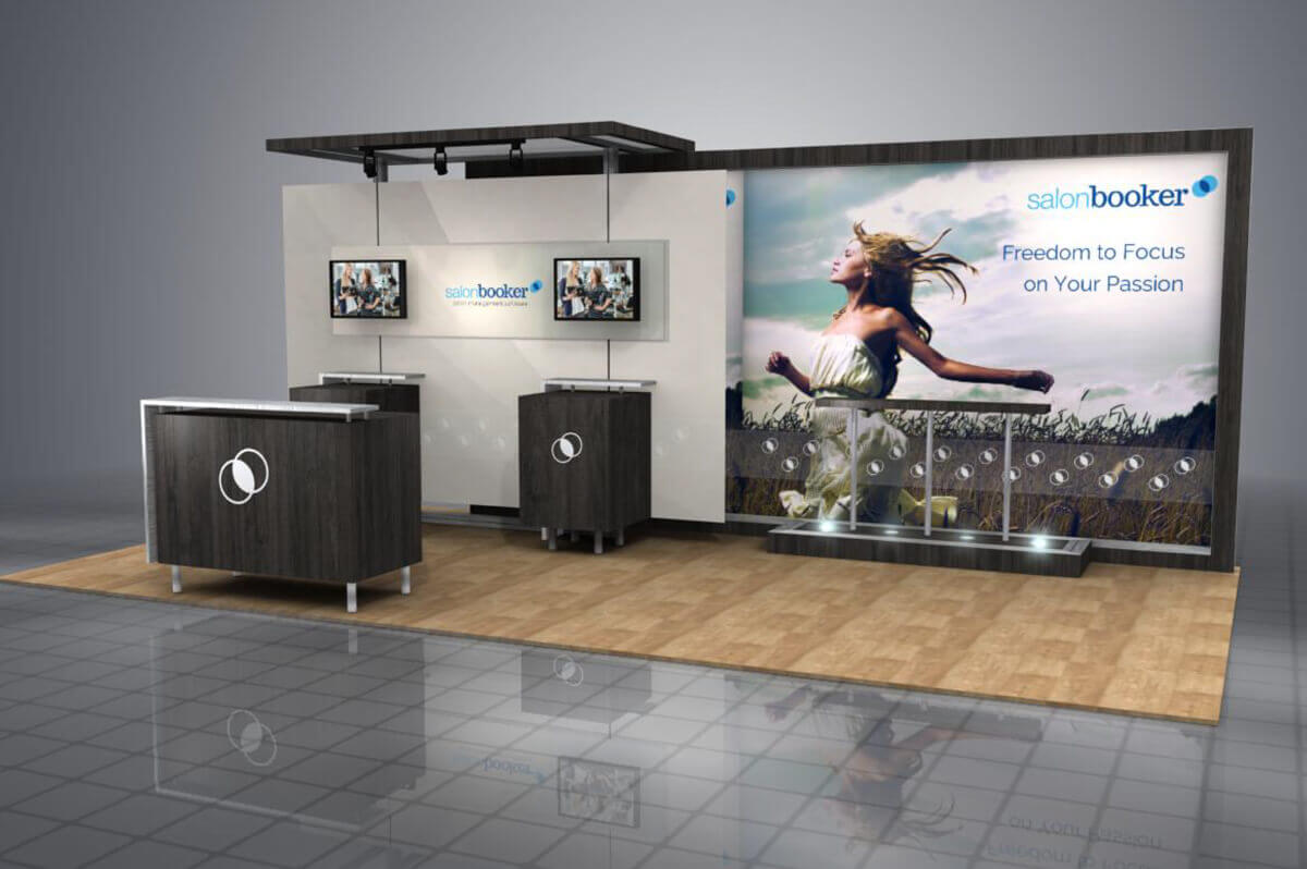
                    <li>10x10</li>
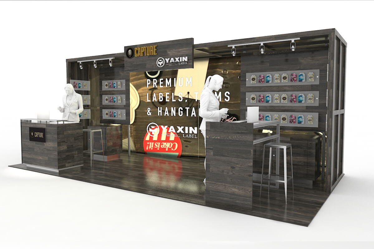
                    <li>10x20</li>
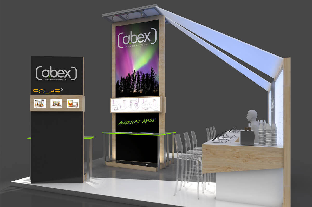
                    <li>20x20</li>
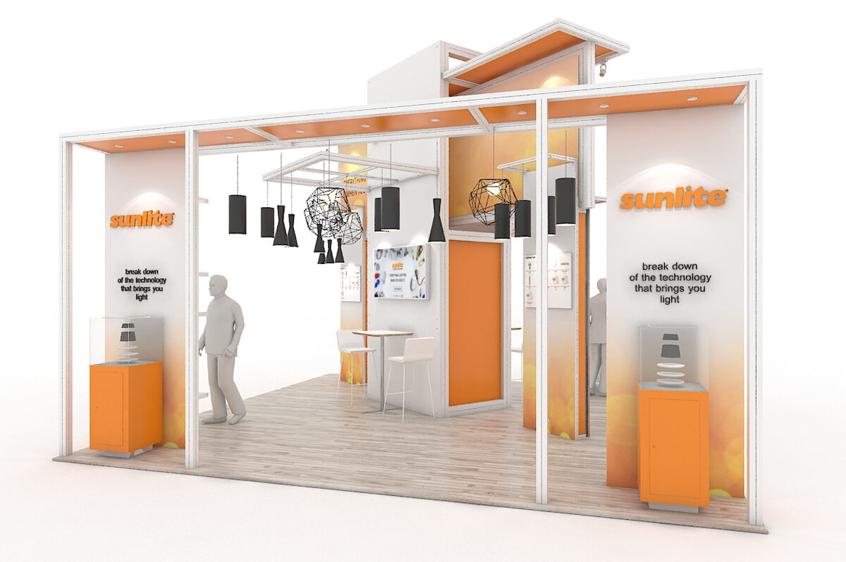
                    <li>20x30+</li>
                </ul>

                <div class="resp-tabs-container">

                    <!-- Magnific Popup Image -->
                    <div data-lightbox="gallery" class="row row-no-gutter offset-2 ">

                        <div class="col-xs-6 col-sm-4">
                            <a class="thumb" data-lightbox="image" href="images/10x10-1.jpg">
                                <img src="images/10x10-1-th.jpg" alt=""/>
                                <span class="thumb__overlay fa fa-search"></span>
                            </a>
                        </div>

                        <div class="col-xs-6 col-sm-4">
                            <a class="thumb" data-lightbox="image" href="images/10x10-2.jpg">
                                <img src="images/10x10-2-th.jpg" alt=""/>
                                <span class="thumb__overlay fa fa-search"></span>
                            </a>
                        </div>

                        <div class="col-xs-6 col-sm-4">
                            <a class="thumb" data-lightbox="image" href="images/10x10-3.jpg">
                                <img src="images/10x10-3-th.jpg" alt=""/>
                                <span class="thumb__overlay fa fa-search"></span>
                            </a>
                        </div>
                        
                        <div class="col-xs-6 col-sm-4">
                            <a class="thumb" data-lightbox="image" href="images/10x10-4.jpg">
                                <img src="images/10x10-4-th.jpg" alt=""/>
                                <span class="thumb__overlay fa fa-search"></span>
                            </a>
                        </div>

                        <div class="col-xs-6 col-sm-4">
                            <a class="thumb" data-lightbox="image" href="images/10x10-5.jpg">
                                <img src="images/10x10-5-th.jpg" alt=""/>
                                <span class="thumb__overlay fa fa-search"></span>
                            </a>
                        </div>

                        <div class="col-xs-6 col-sm-4">
                            <a class="thumb" data-lightbox="image" href="images/10x10-6.jpg">
                                <img src="images/10x10-6-th.jpg" alt=""/>
                                <span class="thumb__overlay fa fa-search"></span>
                            </a>
                        </div>
                        
                    </div>
                    <!-- END Magnific Popup Image -->

                    <!-- Magnific Popup Image -->
                    <div data-lightbox="gallery" class="row row-no-gutter offset-2">

                        <div class="col-xs-6 col-sm-4">
                            <a class="thumb" data-lightbox="image" href="images/10x20-1.jpg">
                                <img src="images/10x20-1-th.jpg" alt=""/>
                                <span class="thumb__overlay fa fa-search"></span>
                            </a>
                        </div>

                        <div class="col-xs-6 col-sm-4">
                            <a class="thumb" data-lightbox="image" href="images/10x20-2.jpg">
                                <img src="images/10x20-2-th.jpg" alt=""/>
                                <span class="thumb__overlay fa fa-search"></span>
                            </a>
                        </div>
                        
                        <div class="col-xs-6 col-sm-4">
                            <a class="thumb" data-lightbox="image" href="images/10x20-3.jpg">
                                <img src="images/10x20-3-th.jpg" alt=""/>
                                <span class="thumb__overlay fa fa-search"></span>
                            </a>
                        </div>
                        
                        <div class="col-xs-6 col-sm-4">
                            <a class="thumb" data-lightbox="image" href="images/10x20-4.jpg">
                                <img src="images/10x20-4-th.jpg" alt=""/>
                                <span class="thumb__overlay fa fa-search"></span>
                            </a>
                        </div>

                        <div class="col-xs-6 col-sm-4">
                            <a class="thumb" data-lightbox="image" href="images/10x20-5.jpg">
                                <img src="images/10x20-5-th.jpg" alt=""/>
                                <span class="thumb__overlay fa fa-search"></span>
                            </a>
                        </div>
                        
                        <div class="col-xs-6 col-sm-4">
                            <a class="thumb" data-lightbox="image" href="images/10x20-6.jpg">
                                <img src="images/10x20-6-th.jpg" alt=""/>
                                <span class="thumb__overlay fa fa-search"></span>
                            </a>
                        </div>

                    </div>
                    <!-- END Magnific Popup Image -->

                    <!-- Magnific Popup Image -->
                    <div data-lightbox="gallery" class="row row-no-gutter offset-2">

                        <div class="col-xs-6 col-sm-4">
                            <a class="thumb" data-lightbox="image" href="images/20x20-1.jpg">
                                <img src="images/20x20-1-th.jpg" alt=""/>
                                <span class="thumb__overlay fa fa-search"></span>
                            </a>
                        </div>
                        
                        <div class="col-xs-6 col-sm-4">
                            <a class="thumb" data-lightbox="image" href="images/20x20-2.jpg">
                                <img src="images/20x20-2-th.jpg" alt=""/>
                                <span class="thumb__overlay fa fa-search"></span>
                            </a>
                        </div>
                        
                        <div class="col-xs-6 col-sm-4">
                            <a class="thumb" data-lightbox="image" href="images/20x20-3.jpg">
                                <img src="images/20x20-3-th.jpg" alt=""/>
                                <span class="thumb__overlay fa fa-search"></span>
                            </a>
                        </div>
                        
                        <div class="col-xs-6 col-sm-4">
                            <a class="thumb" data-lightbox="image" href="images/20x20-4.jpg">
                                <img src="images/20x20-4-th.jpg" alt=""/>
                                <span class="thumb__overlay fa fa-search"></span>
                            </a>
                        </div>
                        
                        <div class="col-xs-6 col-sm-4">
                            <a class="thumb" data-lightbox="image" href="images/20x20-5.jpg">
                                <img src="images/20x20-5-th.jpg" alt=""/>
                                <span class="thumb__overlay fa fa-search"></span>
                            </a>
                        </div>
                        
                        <div class="col-xs-6 col-sm-4">
                            <a class="thumb" data-lightbox="image" href="images/20x20-6.jpg">
                                <img src="images/20x20-6-th.jpg" alt=""/>
                                <span class="thumb__overlay fa fa-search"></span>
                            </a>
                        </div>


                    </div>
                    <!-- END Magnific Popup Image -->

                    <!-- Magnific Popup Image -->
                    <div data-lightbox="gallery" class="row row-no-gutter offset-2">

                        <div class="col-xs-6 col-sm-4">
                            <a class="thumb" data-lightbox="image" href="images/20x30plus-1.jpg">
                                <img src="images/20x30plus-1-th.jpg" alt=""/>
                                <span class="thumb__overlay fa fa-search"></span>
                            </a>
                        </div>

                        <div class="col-xs-6 col-sm-4">
                            <a class="thumb" data-lightbox="image" href="images/20x30plus-2.jpg">
                                <img src="images/20x30plus-2-th.jpg" alt=""/>
                                <span class="thumb__overlay fa fa-search"></span>
                            </a>
                        </div>
                        
                        <div class="col-xs-6 col-sm-4">
                            <a class="thumb" data-lightbox="image" href="images/20x30plus-3.jpg">
                                <img src="images/20x30plus-3-th.jpg" alt=""/>
                                <span class="thumb__overlay fa fa-search"></span>
                            </a>
                        </div>
                        
                        <div class="col-xs-6 col-sm-4">
                            <a class="thumb" data-lightbox="image" href="images/20x30plus-4.jpg">
                                <img src="images/20x30plus-4-th.jpg" alt=""/>
                                <span class="thumb__overlay fa fa-search"></span>
                            </a>
                        </div>

                        <div class="col-xs-6 col-sm-4">
                            <a class="thumb" data-lightbox="image" href="images/20x30plus-5.jpg">
                                <img src="images/20x30plus-5-th.jpg" alt=""/>
                                <span class="thumb__overlay fa fa-search"></span>
                            </a>
                        </div>
                        
                        <div class="col-xs-6 col-sm-4">
                            <a class="thumb" data-lightbox="image" href="images/20x30plus-6.jpg">
                                <img src="images/20x30plus-6-th.jpg" alt=""/>
                                <span class="thumb__overlay fa fa-search"></span>
                            </a>
                        </div>

                    </div>
                    <!-- END Magnific Popup Image -->

                    <!-- Magnific Popup Image -->
                    <div data-lightbox="gallery" class="row row-no-gutter offset-2">

                        
                    </div>
                    <!-- END Magnific Popup Image -->


                </div>
            </div>

        </section>
        <!-- END section latest and greatest-->

        <!-- section move to modular-->
        <section class="well-sm well-sm--inset-2 bg-primary bg-image-2">
            <div class="container">
            <center>
                <h2>move to modular</h2>
                <hr/>
                <div class="row offset-3 text-sm-left">
                    <div class="col-md-3 col-sm-6">
                        <span class="icon icon-lg text-bold fa-balance-scale icon-mod-1"></span>
                        <h6><a href="#">Less Weight</a></h6>

                        <p>Let us help you design and build an exhibit that is easy to take from show to show, at 1/3 of the standard weight. Save yourself from excessive drayage costs!</p>
                    </div>
                    <div class="col-md-3 col-sm-6">
                        <span class="icon icon-lg text-bold home fa-expand icon-mod-1"></span>
                        <h6><a href="#">Reconfigurable</a></h6>

                        <p>We pride ourselves in the ability to design a custom modular exhibit that can be reconfigured for a 10x10 or 10x20 booth space, or whatever your next show calls for.</p>
                    </div>
                    <div class="col-md-3 col-sm-6">
                        <span class="icon icon-lg text-bold fa-users icon-mod-1"></span>
                        <h6><a href="#">Design Team</a></h6>

                        <p>Our team of award-winning exhibit designers and established graphic designers are eager to work with you on creating a show-stopping booth.</p>
                    </div>
                    <div class="col-md-3 col-sm-6 inset-1">
                        <span class="icon icon-lg text-bold fa-picture-o icon-mod-1"></span>
                        <h6 class="offset-5"><a href="#">The Best Graphics</a></h6>

                        <p>Abex has the latest in printing technology, with the highest quality UV flatbed printers capable of printing in ultra-fine variable dots on panels up to 96"W.</p>
                    </div>
                </div>
                <a class="btn btn-primary btn-md " href="#">Read More</a>
                </center>

            </div>
        </section>
        <!-- END section partners-->

        <!-- parallax -->
        <section class="rd-parallax">
            <div class="rd-parallax-layer bg-overlay2" data-speed="1" data-type="media"
                 data-url="images/parallax2.jpg"></div>
            <div class="rd-parallax-layer" data-speed="0.3" data-type="html" data-direction="inverse">
                <div class="container well-xl z-index">
                    <div class="row text-sm-left">
                        <div class="col-sm-12">
                        <center>
                            <h2>CUSTOM</h2>
                            <hr/>
                            <h6>Custom Exhibit Design</h6>

                            <h7 class="inset-2">We love designing custom exhibits. From a wide range of materials and lightweight aluminum extrusions, we take pride in the ability to design and fabricate a fully custom system tailored to your brand and company style. Whether for a highly competitive trade show, retail space or event, our exhibit designers understand what draws attention to your booth and what propels interaction.</h7>
                            <a class="btn btn-primary btn-md" href="#">Read more</a>
                            </center>
                        </div>
                    </div>
                </div>
            </div>
        </section>
        <!-- END parallax -->

        <!-- section newsletter -->
        <section class="bg-primary bg-image bg-image-3 well-sm well-sm--inset-2">
            <div class="container">
                <h2>keep up with us</h2>
                <hr/>
                        <!-- Begin MailChimp Signup Form -->
<link href="//cdn-images.mailchimp.com/embedcode/horizontal-slim-10_7.css" rel="stylesheet" type="text/css">
<style type="text/css">
	#mc_embed_signup{clear:left; font:14px Helvetica,Arial,sans-serif; width:100%;}
	/* Add your own MailChimp form style overrides in your site stylesheet or in this style block.
	   We recommend moving this block and the preceding CSS link to the HEAD of your HTML file. */
</style>
<div id="mc_embed_signup">
<form action="//abex.us13.list-manage.com/subscribe/post?u=2d7e76c3d09dadba9da13cc6f&amp;id=42a52090cd" method="post" id="mc-embedded-subscribe-form" name="mc-embedded-subscribe-form" class="validate" target="_blank" novalidate>
    <div id="mc_embed_signup_scroll">
	<label for="mce-EMAIL">Subscribe to our mailing list</label>
    <br>
	<input type="email" value="" name="EMAIL" class="email" id="mce-EMAIL" placeholder="email address" required>
    <!-- real people should not fill this in and expect good things - do not remove this or risk form bot signups-->
    <div style="position: absolute; left: -5000px;" aria-hidden="true"><input type="text" name="b_2d7e76c3d09dadba9da13cc6f_42a52090cd" tabindex="-1" value=""></div>
    <div class="clear"><input type="submit" value="Subscribe" name="subscribe" id="mc-embedded-subscribe" class="button"></div>
    </div>
</form>
</div>

<!--End mc_embed_signup-->
                    </div>
        </section>
        <!-- END section newsletter-->
        
        
        <!-- section instagram -->
        
        <script type="text/javascript">
    var userFeed = new Instafeed({
        get: 'user',
        userId: 2959753655,
        accessToken: '2959753655.1677ed0.1a6b47bfa13e4dcba0143aa66e3ffd53',
      resolution: 'low_resolution',
      limit: 5

    });
    userFeed.run();
</script> 
        
        <section class="bg-primary bg-image bg-image-4 well-sm well-sm--inset-2">
                <h2>instagram</h2>
                <hr/>
                <div id="insta-wrap">
   <div id="instafeed">
      
            </div>
    <div class="follow">follow us on Instagram: <a target="_blank" href="https://www.instagram.com/abexexhibits/">@abexexhibits</a></div>
</div>
        </section>
        
        <!-- END section instagram-->
    </main>
    <!--========================================================
                              FOOTER
    ==========================================================-->
    <footer class="page-footer text-center">
        <!-- section7 -->
        <section class="well-md">
            <div class="container">

                <h2>contact us</h2>
                <hr/>
                <div class="row">
                    <div class="col-xs-4">
                        <span class="icon icon-md icon-primary fl-continuous-house150"></span>
                        <address>
                            <a href="">355 Parkside Dr,<br>
                                San Fernando, CA 91340</a>
                        </address>
                    </div>
                    <div class="col-xs-4 inset-3">
                        <span class="icon icon-xs icon-primary fa fa-phone mob"></span>

                        <p><a href="callto:8005370231">+1 800 537 0231</a></p>
                    </div>
                    <div class="col-xs-4">
                        <span class="icon icon-md icon-primary fl fl-continuous-envelope42"></span>

                        <p><a href="mailto:info@abex.com">info@abex.com</a></p>
                    </div>
                </div>

                <p class="copyright">
                    Abex Exhibit Systems © <span id="copyright-year"></span>
                    <a href='index-6.html'>All rights reserved</a>
                </p>
            </div>
        </section>
        <!-- END section7-->

        <!-- RD Google Map -->
        <div class="rd-google-map">
            <div id="google-map" class="rd-google-map__model"></div>
            <ul class="rd-google-map__locations">
                    <li data-x="-118.4340025" data-y="34.2812158" data-basic="images/gmap_park.png"
                    data-active="images/gmap_park_active.png">
                        <p> 355 Parkside Dr, San Fernando CA 91340. <span>800-537-0231</span></p>
                </li>
                    <li data-x="-118.4340025" data-y="34.2812158">
                        <p> 355 Parkside Dr, San Fernando CA 91340. <span>800-537-0231</span></p>
                </li>
                    <li data-x="-118.4340025" data-y="34.2812158" data-basic="images/gmap_cart.png"
                    data-active="images/gmap_cart_active.png">
                        <p> 355 Parkside Dr, San Fernando CA 91340. <span>800-537-0231</span></p>
                </li>
            </ul>
        </div>
        <!-- END RD Google Map -->
    </footer>
</div>

<!-- Core Scripts -->
<script src="js/core.min.js"></script>
<!-- Additional Functionality Scripts -->
<script src="js/script2.js"></script>

<script>
$(document).ready(function() {
	$('.popup-youtube').magnificPopup({
		disableOn: 700,
		type: 'iframe',
		mainClass: 'mfp-fade',
		removalDelay: 160,
		preloader: false,

		fixedContentPos: false
	});
});
</script>
</body>
</html>